Programming Python (67 page)

Besides showing a
menu at the top, it is common for windows to display a row
of buttons at the bottom. This bottom button row is usually called a
toolbar, and it often contains shortcuts to items also available in the
menus at the top. It’s easy to add a toolbar to windows in
tkinter—simply pack buttons (and other kinds of widgets) into a frame,
pack the frame on the bottom of the window, and set it to expand
horizontally only. This is really just hierarchical GUI layout at work
again, but make sure to pack toolbars (and frame-based menu bars) early
so that other widgets in the middle of the display are clipped first
when the window shrinks; you usually want your tool and menu bars to
outlive other widgets.
Example 9-8
shows one
way to go about adding a toolbar to a window. It also demonstrates how
to add photo images in menu entries (set theimageattribute to aPhotoImageobject) and
how to disable entries and give them a grayed-out appearance (call the
menuentryconfigmethod with the
index of the item to disable, starting from 1). Notice thatPhotoImageobjects are saved as a list;
remember, unlike other widgets, these go away if you don’t hold on to
them (see
Chapter 8
if you need a
refresher).
Example 9-8. PP4E\Gui\Tour\menuDemo.py
#!/usr/local/bin/python
"""
Tk8.0 style main window menus
menu/tool bars packed before middle, fill=X (pack first=clip last);
adds photo menu entries; see also: add_checkbutton, add_radiobutton
"""
from tkinter import *                              # get widget classes
from tkinter.messagebox import *                   # get standard dialogs
class NewMenuDemo(Frame):                          # an extended frame
def __init__(self, parent=None):               # attach to top-level?
Frame.__init__(self, parent)               # do superclass init
self.pack(expand=YES, fill=BOTH)
self.createWidgets()                       # attach frames/widgets
self.master.title("Toolbars and Menus")    # set window-manager info
self.master.iconname("tkpython")           # label when iconified
def createWidgets(self):
self.makeMenuBar()
self.makeToolBar()
L = Label(self, text='Menu and Toolbar Demo')
L.config(relief=SUNKEN, width=40, height=10, bg='white')
L.pack(expand=YES, fill=BOTH)
def makeToolBar(self):
toolbar = Frame(self, cursor='hand2', relief=SUNKEN, bd=2)
toolbar.pack(side=BOTTOM, fill=X)
Button(toolbar, text='Quit',  command=self.quit    ).pack(side=RIGHT)
Button(toolbar, text='Hello', command=self.greeting).pack(side=LEFT)
def makeMenuBar(self):
self.menubar = Menu(self.master)
self.master.config(menu=self.menubar)    # master=top-level window
self.fileMenu()
self.editMenu()
self.imageMenu()
def fileMenu(self):
pulldown = Menu(self.menubar)
pulldown.add_command(label='Open...', command=self.notdone)
pulldown.add_command(label='Quit',    command=self.quit)
self.menubar.add_cascade(label='File', underline=0, menu=pulldown)
def editMenu(self):
pulldown = Menu(self.menubar)
pulldown.add_command(label='Paste',   command=self.notdone)
pulldown.add_command(label='Spam',    command=self.greeting)
pulldown.add_separator()
pulldown.add_command(label='Delete',  command=self.greeting)
pulldown.entryconfig(4, state=DISABLED)
self.menubar.add_cascade(label='Edit', underline=0, menu=pulldown)
def imageMenu(self):
photoFiles = ('ora-lp4e.gif', 'pythonPowered.gif', 'python_conf_ora.gif')
pulldown = Menu(self.menubar)
self.photoObjs = []
for file in photoFiles:
img = PhotoImage(file='../gifs/' + file)
pulldown.add_command(image=img, command=self.notdone)
self.photoObjs.append(img)   # keep a reference
self.menubar.add_cascade(label='Image', underline=0, menu=pulldown)
def greeting(self):
showinfo('greeting', 'Greetings')
def notdone(self):
showerror('Not implemented', 'Not yet available')
def quit(self):
if askyesno('Verify quit', 'Are you sure you want to quit?'):
Frame.quit(self)
if __name__ == '__main__':  NewMenuDemo().mainloop()  # if I'm run as a script
When run, this script generates the scene in
Figure 9-10
at first.
Figure 9-11
shows this window after
being stretched a bit, with its Image menu torn off and its Edit menu
selected. The toolbar at the bottom grows horizontally with the window
but not vertically. For emphasis, this script also sets the cursor to
change to a hand when moved over the toolbar at the bottom. Run this on
your own to get a better
feel for its behavior.
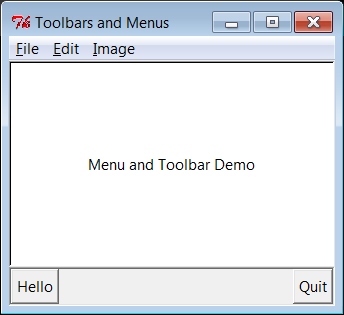
Figure 9-10. menuDemo: menus and toolbars
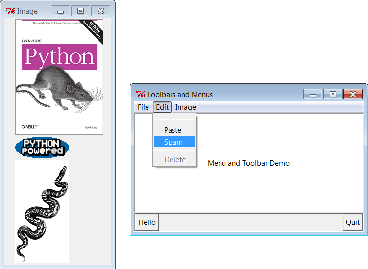
Figure 9-11. Images and tear-offs on the job
As shown in
Figure 9-11
,
it’s easy to
use images for menu items. Although not used in
Example 9-8
,
toolbar
items can be pictures too, just like the
Image menu’s items—simply associate small images with toolbar frame
buttons, just as we did in the image button examples we wrote in the
last part of
Chapter 8
. If you
create toolbar images manually ahead of time, it’s simple to associate
them with buttons as we’ve learned. In fact, it’s not much more work
to build them dynamically—the PIL-based thumbnail image construction
skills we developed in the prior chapter might come in handy in this
context as well.
To illustrate, make sure you’ve installed the PIL
extension, and replace the toolbar construction method
of
Example 9-8
with the
following (I’ve done this in file
menuDemo2.py
in the examples distribution
so you can run and experiment on your own):
# resize toolbar images on the fly with PIL
def makeToolBar(self, size=(40, 40)):
from PIL.ImageTk import PhotoImage, Image     # if jpegs or make new thumbs
imgdir = r'../PIL/images/'
toolbar = Frame(self, cursor='hand2', relief=SUNKEN, bd=2)
toolbar.pack(side=BOTTOM, fill=X)
photos = 'ora-lp4e-big.jpg', 'PythonPoweredAnim.gif', 'python_conf_ora.gif'
self.toolPhotoObjs = []
for file in photos:
imgobj = Image.open(imgdir + file)        # make new thumb
imgobj.thumbnail(size, Image.ANTIALIAS)   # best downsize filter
img = PhotoImage(imgobj)
btn = Button(toolbar, image=img, command=self.greeting)
btn.config(relief=RAISED, bd=2)
btn.config(width=size[0], height=size[1])
btn.pack(side=LEFT)
self.toolPhotoObjs.append((img, imgobj))  # keep a reference
Button(toolbar, text='Quit', command=self.quit).pack(side=RIGHT, fill=Y)
When run, this alternative creates the window captured in
Figure 9-12
—the three image
options available in the Image menu at the top of the window are now
also buttons in the toolbar at the bottom, along with a simple text
button for quitting on the right. As before, the cursor becomes a hand
over the toolbar.
You don’t need PIL at all if you’re willing to use GIF or
supported bitmap images that you create by hand manually—simply load
by filename using the standard tkinter photo object, as shown by the
following alternative coding for the toolbar construction method (this
is file
menuDemo3.py
in the
examples distribution if you’re keeping scope):
# use unresized gifs with standard tkinter
def makeToolBar(self, size=(30, 30)):
imgdir = r'../gifs/'
toolbar = Frame(self, cursor='hand2', relief=SUNKEN, bd=2)
toolbar.pack(side=BOTTOM, fill=X)
photos = 'ora-lp4e.gif', 'pythonPowered.gif', 'python_conf_ora.gif'
self.toolPhotoObjs = []
for file in photos:
img = PhotoImage(file=imgdir + file)
btn = Button(toolbar, image=img, command=self.greeting)
btn.config(bd=5, relief=RIDGE)
btn.config(width=size[0], height=size[1])
btn.pack(side=LEFT)
self.toolPhotoObjs.append(img)  # keep a reference
Button(toolbar, text='Quit', command=self.quit).pack(side=RIGHT, fill=Y)
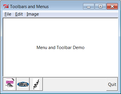
Figure 9-12. menuDemo2: images in the toolbar with PIL
When run, this alternative uses GIF images, and renders the
window grabbed in
Figure 9-13
. Depending on
your user’s preferences, you might want to resize the GIF images used
here for this role with other tools; we only get part of unresized
photos in the fixed-width buttons, which may or may not be
enough.
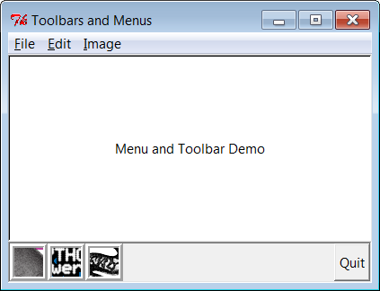
Figure 9-13. menuDemo3: unresized GIF images in the toolbar
As is, this is something of a first cut solution to toolbar
image buttons. There are many ways to configure such image buttons.
Since we’re going to see PIL in action again later in this chapter
when we explore canvases, though, we’ll leave further extensions in
the suggested exercise
column.
Menus are a
powerful tkinter interface device. If you’re like me,
though, the examples in this section probably seem like a lot of work.
Menu construction can be both code intensive and error prone if done
by calling tkinter methods directly. A better approach might
automatically build and link up menus from a higher-level description
of their contents. In fact, in
Chapter 10
, we’ll meet a tool
called GuiMixin that automates the menu construction
process, given a data structure that contains all menus desired. As an
added bonus, it supports both window and frame-style menus, so it can
be used by both standalone programs and nested components. Although
it’s important to know the underlying calls used to make menus, you
don’t necessarily have to remember them for
long.
Let’s rejoin our
widget tour.Listboxwidgets allow you to display a list of items for selection, andScrollbars are designed for navigating through
the contents of other widgets. Because it is common to use these widgets
together, we’ll study them both at once.
Example 9-9
builds both aListboxand aScrollbar, as a packaged set.
Example 9-9. PP4E\Gui\Tour\scrolledlist.py
"a simple customizable scrolled listbox component"
from tkinter import *
class ScrolledList(Frame):
def __init__(self, options, parent=None):
Frame.__init__(self, parent)
self.pack(expand=YES, fill=BOTH)                   # make me expandable
self.makeWidgets(options)
def handleList(self, event):
index = self.listbox.curselection()                # on list double-click
label = self.listbox.get(index)                    # fetch selection text
self.runCommand(label)                             # and call action here
# or get(ACTIVE)
def makeWidgets(self, options):
sbar = Scrollbar(self)
list = Listbox(self, relief=SUNKEN)
sbar.config(command=list.yview)                    # xlink sbar and list
list.config(yscrollcommand=sbar.set)               # move one moves other
sbar.pack(side=RIGHT, fill=Y)                      # pack first=clip last
list.pack(side=LEFT, expand=YES, fill=BOTH)        # list clipped first
pos = 0
for label in options:                              # add to listbox
list.insert(pos, label)                        # or insert(END,label)
pos += 1                                       # or enumerate(options)
#list.config(selectmode=SINGLE, setgrid=1)          # select,resize modes
list.bind('', self.handleList)           # set event handler
self.listbox = list
def runCommand(self, selection):                       # redefine me lower
print('You selected:', selection)
if __name__ == '__main__':
options = (('Lumberjack-%s' % x) for  x in range(20))  # or map/lambda, [...]
ScrolledList(options).mainloop()
This module can be run standalone to experiment with these widgets,
but it is also designed to be useful as a library object. By passing in
different selection lists to theoptionsargument and redefining therunCommandmethod in a subclass, theScrolledListcomponent class
defined here can be reused anytime you need to display a
scrollable list. In fact, we’ll be reusing it this way in
Chapter 11
’s PyEdit program. With just a little
forethought, it’s easy to extend the tkinter library with Python classes
this way.
When run standalone, this script generates the window in
Figure 9-14
, shown here with Windows 7
look-and-feel. It’s aFrame, with aListboxon its left containing 20
generated entries (the fifth has been clicked), along with an associatedScrollbaron its right for moving
through the list. If you move the scroll, the list moves, and vice
versa.
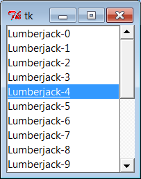
Figure 9-14. scrolledlist at the top
Listboxes are
straightforward to use, but they are populated and
processed in somewhat unique ways compared to the widgets we’ve seen so
far. Many listbox calls accept a passed-in index to refer to an entry in
the list. Indexes start at integer 0 and grow higher, but tkinter also
accepts special name strings in place of integer offsets:endto refer to the end of the list,activeto denote the line selected, and more.
This generally yields more than one way to code listbox calls.
For instance, this script adds items to the listbox in this window
by
calling itsinsertmethod, with successive offsets (starting at zero—something theenumeratebuilt-in could automate for
us):
list.insert(pos, label)
pos += 1
But you can also fill a list by simply adding items at the end
without keeping a position counter at all, with either of these
statements:
list.insert('end', label)     # add at end: no need to count positions
list.insert(END, label)       # END is preset to 'end' inside tkinter
The listbox widget doesn’t have anything like thecommandoption we use to register callback
handlers for button presses, so you either need to fetch listbox
selections while processing other widgets’ events (e.g., a button press
elsewhere in the GUI) or tap into other event protocols to process user
selections. To fetch a selected value, this script binds the
double-click event to a callback handler method withbind(seen earlier on this tour).
In the double-click handler, this script grabs the selected item
out of the listbox with this pair of listbox method calls:
index = self.listbox.curselection()       # get selection index
label = self.listbox.get(index)           # fetch text by its index
Here, too, you can code this differently. Either of the following
lines has the same effect; they get the contents of the line at index'active'—the one selected:
label = self.listbox.get('active')        # fetch from active index
label = self.listbox.get(ACTIVE)          # ACTIVE='active' in tkinter
For illustration purposes, the class’s defaultrunCommandmethod
prints the value selected each time you double-click an entry in the
list—as fetched by this script, it comes back as a string reflecting the
text in the selected entry:
C:\...\PP4E\Gui\Tour>python scrolledlist.pyYou selected: Lumberjack-2
You selected: Lumberjack-19
You selected: Lumberjack-4
You selected: Lumberjack-12
Listboxes can also be useful input devices even without attached
scroll bars; they accept color, font, and relief configuration options.
They also support both single and multiple selection modes. The default
mode allows only a single item to be selected, but theselectmodeargument supports four settings:SINGLE,BROWSE,MULTIPLE, andEXTENDED(the default isBROWSE). Of these, the first two are single
selection modes, and the last two allow multiple items to be
selected.
These modes vary in subtle ways. For instance,BROWSEis likeSINGLE, but it also allows the selection to be
dragged. Clicking an item inMULTIPLEmode toggles its state without affecting other selected items. And theEXTENDEDmode allows for multiple
selections and works like the Windows file explorer GUI—you select one
item with a simple click, multiple items with a Ctrl-click combination,
and ranges of items with Shift-clicks. Multiple selections can be
programmed with code of this sort:
listbox = Listbox(window, bg='white', font=('courier', fontsz))
listbox.config(selectmode=EXTENDED)
listbox.bind('', (lambda event: onDoubleClick()))
# onDoubeClick: get messages selected in listbox
selections = listbox.curselection()           # tuple of digit strs, 0..N-1
selections = [int(x)+1 for x in selections]   # convert to ints, make 1..N
When multiple selections are enabled,
thecurselectionmethod
returns a list of digit strings giving the relative numbers of the items
selected, or it returns an empty tuple if none is selected. Really, this
method always returns a tuple of digit strings, even in single selection
mode (we don’t care in
Example 9-9
, because thegetmethod does the right thing for a one-item
tuple, when fetching a value out of the listbox).
You can experiment with the selection alternatives on your own by
uncommenting theselectmodesetting
in
Example 9-9
and changing
its value. You may get an error on double-clicks in multiple selection
modes, though, because thegetmethod
will be passed a tuple of more than one selection index (print it out to
see for yourself). We’ll see multiple selections in action in the
PyMailGUI example later in this book (
Chapter 14
), so I’ll pass on further examples
here.
Perhaps the deepest
magic in the
Example 9-9
script, though, boils
down to two lines of code:
sbar.config(command=list.yview)              # call list.yview when I move
list.config(yscrollcommand=sbar.set)         # call sbar.set when I move
The scroll bar and listbox are effectively cross-linked to each
other through these configuration options; their values simply refer to
bound widget methods of the other. By linking like this, tkinter
automatically keeps the two widgets in sync with each other as they
move. Here’s how this works:
Moving a scroll bar invokes the callback handler registered
with itscommandoption. Here,list.yviewrefers to a built-in
listbox method that adjusts the listbox display proportionally,
based on arguments passed to the handler.Moving a listbox vertically invokes the callback handler
registered with itsyscrollcommandoption. In this script, thesbar.setbuilt-in
method adjusts a scroll bar proportionally.
In other words, moving one automatically moves the other. It turns
out that every scrollable object in tkinter—Listbox,Entry,Text, andCanvas—has built-inyviewandxviewmethods
to process incoming vertical and horizontal scroll
callbacks, as well asyscrollcommandandxscrollcommandoptions for specifying an associated scroll bar’s callback
handler to invoke. All scroll bars have acommandoption, to name an associated widget’s
handler to be called on moves. Internally, tkinter passes information to
all of these methods, and that information specifies their new position
(e.g., “go 10 percent down from the top”), but your scripts usually need
never deal with that level of detail.
Because the scroll bar and listbox have been cross-linked in their
option settings, moving the scroll bar automatically moves the list, and
moving the list automatically moves the scroll bar. To move the scroll
bar, either drag the solid part or click on its arrows or empty areas.
To move the list, click on the list and either use your arrow keys or
move the mouse pointer above or below the listbox without releasing the
mouse button. In all cases, the list and scroll bar move in unison.
Figure 9-15
shows the scene after
expanding the window and moving down a few entries in the list, one way
or another.
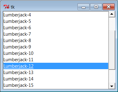
Figure 9-15. scrolledlist in the middle
Finally, remember that
widgets packed last are always clipped first when a window
is shrunk. Because of that, it’s important to pack scroll bars in a
display as soon as possible so that they are the last to go when the
window becomes too small for everything. You can generally make do with
less than complete listbox text, but the scroll bar is crucial for
navigating through the list. As
Figure 9-16
shows, shrinking this script’s
window cuts out part of the list but retains the scroll bar.
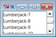
Figure 9-16. scrolledlist gets small
At the same time, you don’t generally want a scroll bar to expand
with a window, so be sure to pack it with just afill=Y(orfill=Xfor a horizontal scroll) and not anexpand=YES. Expanding this example’s
window in
Figure 9-15
, for instance,
made the listbox grow along with the window, but it kept the scroll bar
attached to the right and kept it the same size.
We’ll see both scroll bars and listboxes repeatedly in later
examples in this and later chapters (flip ahead to examples for PyEdit,
PyMailGUI, PyForm, PyTree, and ShellGui for more). And although the
example script in this section captures the fundamentals, I should point
out that there is more to both scroll bars and listboxes than meets the
eye here.
For example, it’s just as easy to add
horizontal
scroll bars to scrollable widgets. They
are programmed almost exactly like the vertical one implemented here,
but callback handler names start with “x,” not “y” (e.g.,xscrollcommand), and anorient='horizontal'configuration option is set
for the scroll bar object. To add both vertical and horizontal scrolls
and to crosslink their motions, you would use the following sort of
code:
window  = Frame(self)
vscroll = Scrollbar(window)
hscroll = Scrollbar(window, orient='horizontal')
listbox = Listbox(window)
# move listbox when scroll moved
vscroll.config(command=listbox.yview, relief=SUNKEN)
hscroll.config(command=listbox.xview, relief=SUNKEN)
# move scroll when listbox moved
listbox.config(yscrollcommand=vscroll.set, relief=SUNKEN)
listbox.config(xscrollcommand=hscroll.set)
See the image viewer canvas later in this chapter, as well as the
PyEdit, PyTree, and PyMailGUI programs later in this book, for examples
of horizontal scroll bars at work. Scroll bars see more kinds of GUI
action too—they can be associated with other kinds of widgets in the
tkinter library. For instance, it is common to attach one to theTextwidget. Not entirely by
coincidence, this brings us to the next point of interest on our widget
tour.