Alex’s Adventures in Numberland (67 page)
Read Alex’s Adventures in Numberland Online
Authors: Alex Bellos

The gentle diagnals in Pascal’s triangle reveal the Fibonacci sequence.
Fibonacci numbers are embedded in the triangle as the sums of what are called the ‘gentle’ diagonals. A gentle diagonal is one that moves from any number to the number underneath to the left and then along one space to the left, or above and to the right and then along one space to the right. The first and second diagonals consist simply of 1. The third has 1 and 1, which equals 2. The fourth has 1 and 2, which adds up to 3. The fifth gentle diagonal gives us 1 + 3 + 1 = 5. The sixth is 1 + 4 + 3 = 8. So far we have generated 1, 1, 2, 3, 5, 8, and the next ones are the subsequent Fibonacci numbers in order.
Ancient Indian interest in Pascal’s triangle concerned combinations of objects. For instance, imagine we have three fruits: a mango, a lychee and a banana. There is only one combination of three items: mango, lychee, banana. If we want to select only two fruits, we can do this in three different ways: mango and lychee, mango and banana, lychee and banana. There are also only three ways of taking the fruit individually, which is each fruit on its own. The final option is to select zero fruit, and this can happen in only one way. In other words, the number of combinations of three different fruits produces the string 1, 3, 3, 1 – the third line of Pascal’s triangle.
If we had four objects, the number of combinations when taken none-at-a-time, individually, two-at-a-time, three-at-a-time and four-at-a-time is 1, 4, 6, 4, 1 – the fourth line of Pascal’s triangle. We can continue this for more and more objects and we see that Pascal’s triangle is really a reference table for the arrangement of things. If we had
n
items and wanted to know how many combinations we could make of
m
of them, the answer is exactly the
m
th position in the
n
th row of Pascal’s triangle. (Note: by convention, the leftmost 1 of any row is taken as the zeroth position in the row.) For example, how many ways are there of grouping three fruits from a selection of seven fruits? There are 35 ways, since the third position on row seven is 35.
Now let’s move on to start combining mathematical objects. Consider the term
x
+
y
. What is (
x
+
y
)
2
? It is the same as (
x
+
y
) (
x
+
y
). To expand this, we need to multiply each term in the first bracket by each term in the second. So, we get
xx
+
xy
+
yx
+
yy
, or x2 + 2
xy
+
y
2
. Spot something here? If we carry on, we can see the pattern more clearly. The coefficients of the individual terms are the rows of Pascal’s triangle.
(
x
+
y
)
2
=
x
2
+ 2
xy
+
y
2(
x
+
y
)
3
=
x
3
+ 3
x
2
y
+ 3
xy
2
+
y
3(
x
+
y
)
4
=
x
4
+ 4
x
3
y
+ 6
x
2
y
2
+ 4
xy
3
+
y
4
The mathematician Abraham de Moivre, a Huguenot refugee living in London in the early eighteenth century, was the first to understand that the coefficients of these equations will approximate a curve the more times you multiply (
x
+
y
) together. He didn’t call it the bell curve, or the curve of error, or the normal distribution, or the Gaussian distribution, which are the names that it later acquired. The curve made its first appearance in mathematics literature in de Moivre’s 1718 book on gaming called
The Doctrine of Chances
. This was the first textbook on probability theory, and another example of how scientific knowledge flourished thanks to gambling.
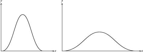
I’ve been treating the bell curve as if it is one curve, when, in fact, it is a family of curves. They all look like a bell, but some are wider than others (see diagram overleaf).

Bell curves with different deviations.
Here’s an explanation for why we get different widths. If Galileo, for example, measured planetary orbits with a twenty-first-century telescope, the margin of error would be less than if he were using his sixteenth-century one. The modern instrument would produce a much thinner bell curve than the antique one. The errors would be much smaller, yet they would still be distributed normally.
The average value of a bell curve is called the mean. The width is called the
deviation
. If we know the mean and the deviation, then we know the shape of the curve. It is incredibly convenient that the normal curve can be described using only two parameters. Perhaps, though, it is too convenient. Often statisticians are overly eager to find the bell curve in their data. Bill Robinson, an economist who heads KPMG’s forensic-accounting division, admits this is the case. ‘We love to work with normal distributions because [the normal distribution] has mathematical properties that have been very well explored. Once we know it’s a normal distribution, we can start to make all sorts of interesting statements.’
Robinson’s job, in basic terms, is to deduce, by looking for patterns in huge data sets, whether someone has been cooking the books. He is carrying out the same strategy that Poincaré used when he weighed his loaves every day, except that Robinson is looking at gigabytes of financial data, and has much more sophisticated statistical tools at his disposal.
Robinson said that his department tends to work on the assumption that for any set of data the default distribution is the normal distribution. ‘We like to assume that the normal curve operates because then we are in the light. Actually, sometimes it doesn’t, and sometimes we probably should be looking in the dark. I think in the financial markets it is true that we have assumed a normal distribution when perhaps it doesn’t work.’ In recent years, in fact, there has been a backlash in both academia and finance against the historic reliance on the normal distribution.
When a distribution is less concentrated around the mean than the bell curve it is called
platykurtic
, from the Greek words
platus
, meaning ‘flat’, and
kurtos
, ‘bulging’. Conversely, when a distribution is more concentrated around the mean it is called
leptokurtic
, from the Greek
leptos
, meaning ‘thin’. William Sealy Gosset, a statistician who worked for the Guinness brewery in Dublin, drew the aide-memoire below in 1908 to remember which was which: a duck-billed platypus was platykurtic, and the kissing kangaroos were leptokurtic. He chose kangaroos because they are ‘noted for “lepping”, though, perhaps, with equal reason they should be hares!’ Gosset’s sketches are the origin of the term
tail
for describing the far-left and far-right sections of a distribution curve.
When economists talk of distributions that are
fat-tailed
or
heavy-tailed
, they are talking of curves that stay higher than normal from the axis at the extremes, as if Gosset’s animals have larger than average tails. These curves describe distributions in which extreme events are more likely than if the distribution were normal. For instance, if the variation in the price of a share were fat-tailed, it would mean there was more of a chance of a dramatic drop, or hike, in price than if the variation were normally distributed. For this reason, it can sometimes be reckless to assume a bell curve over a fat-tailed curve. The economist Nassim Nicholas Taleb’s position in his bestselling book
The Black Swan
is that we have tended to underestimate the size and importance of the tails in distribution curves. He argues that the bell curve is a historically defective model because it cannot anticipate the occurrence of, or predict the impact of, very rare, extreme events – such as a major scientific discovery like the invention of the internet, or of a terrorist attack like 9/11. ‘The ubiquity of the [normal distribution] is not a property of the world,’ he writes, ‘but a problem in our minds, stemming from the way we look at it.’

Platykurtic and leptokurtic distributions.
The desire to see the bell curve in data is perhaps most strongly felt in education. The awarding of grades from A to E in end-of-year exams is based on where a pupil’s score falls on a bell curve to which the distribution of grades is expected to approximate. The curve is divided into sections, with A representing the top section, B the next section down, and so on. For the education system to run smoothly, it is important that the percentage of pupils getting grades A to E each year is comparable. If there are too many As, or too many Es, in one particular year the consequences – not enough, or too many, people on certain courses – would be a strain on resources. Exams are specifically designed in the hope that the distribution of results replicates the bell curve as much as possible – irrespective of whether or not this is an accurate reflection of real intelligence. (It might be as a whole, but is probably not in all cases.)
It has even been argued that the reverence some scientists have for the bell curve actively encourages sloppy practices. We saw from the quincunx that random errors are distributed normally. So, the more random errors we can introduce into measurement, the more likely it is that we will get a bell curve from the data – even if the phenomenon being measured is not normally distributed. When the normal distribution is found in a set of data, this could simply be because the measurements have been gathered too shambolically.
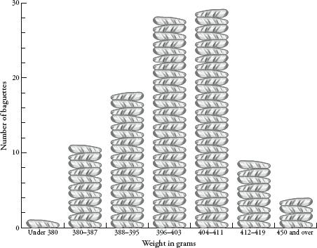
Which brings me back to my baguettes. Were their weights really normally distributed? Was the tail thin or fat? First, a recap. I weighen argued00 baguettes. The distribution of their weights was chapter 10. The graph showed some hopeful trends – there was a mean of somewhere around 400g, and a more or less symmetrical spread between 380 and 420g. If I had been as indefatigable as Henri Poincaré, I would have continued the experiment for a year and had 365 (give or take days of bakery closure) weights to compare. With more data, the distribution would have been clearer. Still, my smaller sample was enough to get an idea of the pattern forming. I used a trick, compressing my results by redrawing the graph with a scale that grouped baguette weights in bounds of 8g rather than 1g. This created the following graph:
