101 Excel 2013 Tips, Tricks and Timesavers (32 page)
Read 101 Excel 2013 Tips, Tricks and Timesavers Online
Authors: John Walkenbach

When you use the pointing technique to create a formula that references a cell in a pivot table, Excel replaces those simple cell references with a much more complicated GETPIVOTDATA function. If you type the cell references manually (rather than pointing to them), Excel does not use the GETPIVOTDATA function.
The reason? Using the GETPIVOTDATA function helps ensure that the formula will continue to reference the intended cells if the pivot table layout is changed.
Figure 79-2 shows the pivot table after expanding the years to show the month detail. As you can see, the formulas in column F still show the correct result even though the referenced cells are in a different location. For example, the summary row for 2011 was originally row 4. After expanding the years, the summary row for 2011 is row 16. Had I used simple cell references, the formula would have returned incorrect results after expanding the years.
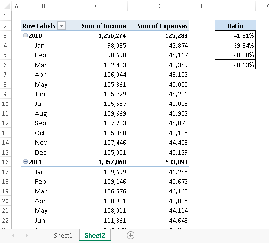
Figure 79-2:
After expanding the pivot table, formulas that used the GETPIVOTDATA function continue to display the correct result.
Using the GETPIVOTDATA function has one caveat: The data that it retrieves must be visible in the pivot table. If you modify the pivot table so that the value used by GETPIVOTDATA is no longer visible, the formula returns an error.
 You may want to prevent Excel from using the GETPIVOTDATA function when you point to pivot table cells when creating a formula. If so, choose PivotTable Tools⇒Analyze⇒PivotTable⇒Options⇒Generate GetPivot Data (this command is a toggle).
Tip 80: Creating a Quick Frequency Tabulation
This tip describes a quick method for creating a frequency tabulation for a single column of data. Figure 80-1 shows a small part of a range that contains more than 20,000 rows of city and state data. The goal is to tally the number of times each state appears in the list.
Although you can tally the states in a number of ways, a pivot table is the easiest choice for this task.
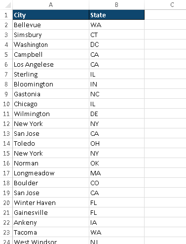
Figure 80-1:
You can use a pivot table to generate a frequency tabulation for these state abbreviations.
Before you get started on this task, make sure that your data column has a heading. In this example, it’s in cell B1.
Activate any cell in the column A or B and then follow these steps:
1.
Choose Insert⇒Tables⇒PivotTable.
The Create PivotTable dialog box appears.
2.
If Excel doesn’t correctly identify the range, change the Table/Range setting.
3.
Specify a location for the PivotTable.
4.
Click OK.
Excel creates an empty pivot table and displays the PivotTable Fields task pane.
5.
Drag the State field into the Rows section.
6.
Drag the State field into the Values section.
Excel creates the pivot table, which shows the frequency of each state (see Figure 80-2).
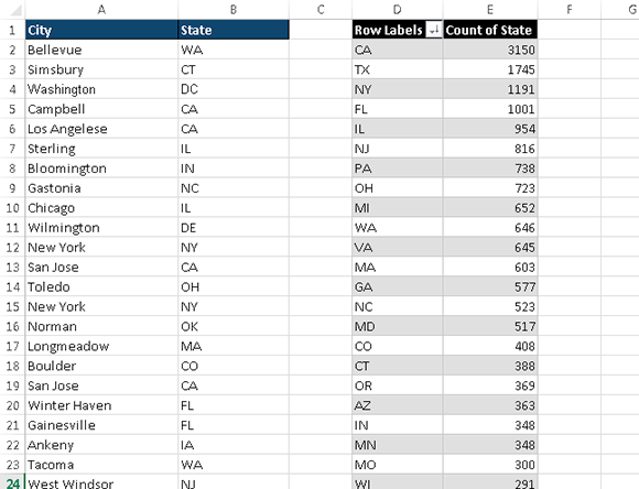
Figure 80-2:
A quick pivot table shows the frequency of each state abbreviation.
This pivot table can be sorted, by using the Home⇒Editing⇒Sort & Filter command. In addition (as shown in Figure 80-3), you can even create a pivot chart to display the counts graphically. Just select any cell in the pivot table and choose PivotTable Tools⇒Analyze⇒Tools⇒PivotChart.
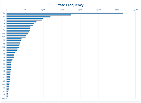
Figure 80-3:
A few mouse clicks creates a chart from the pivot table.
Tip 81: Grouping Items by Date in a Pivot Table
One of the more useful features of a pivot table is the ability to combine items into groups. Grouping items is simple: Select them and choose PivotTable Tools⇒Options⇒Group⇒Group Selection.
You can go a step further, though. When a field contains dates, Excel can create groups automatically. Many users overlook this helpful feature. Figure 81-1 shows a portion of a table that has two columns of data: Date and Sales. This table has 731 rows and covers dates between January 1, 2012, and December 31, 2013. The goal is to summarize the sales information by month.
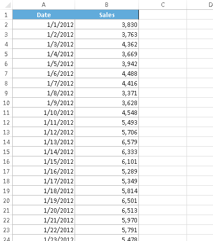
Figure 81-1:
You can use the PivotTable feature to summarize the sales data by month.
Figure 81-2 shows part of a pivot table (in columns D:E) created from the data. Not surprisingly, it looks exactly like the input data because the dates haven’t been grouped.
To group the items by month, right-click any cell in the Date column of the pivot table and select Group from the shortcut menu. You see the Grouping dialog box, shown in Figure 81-3. In the By list box, select Months and Years and verify that the starting and ending dates are correct. Click OK.
The Date items in the pivot table are grouped by years and by months (as shown in Figure 81-4).
The Group command is available only if every item in the field is a date (or a time). Even a single blank cell will make it impossible to group by date.
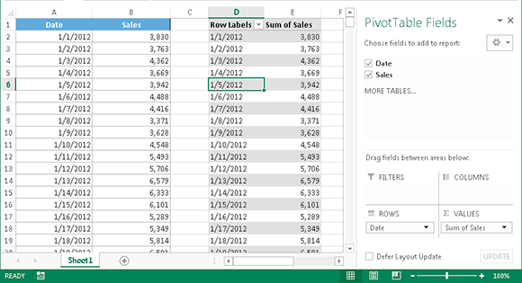
Figure 81-2:
The pivot table, before grouping by months and years.
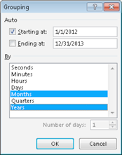
Figure 81-3:
Use the Grouping dialog box to group items in a pivot table.
If you select only Months in the Grouping list box, months in different years are combined. For example, the June item would display sales for both 2012 and 2013.