Read 101 Excel 2013 Tips, Tricks and Timesavers Online
Authors: John Walkenbach
101 Excel 2013 Tips, Tricks and Timesavers (35 page)

4.
Provide a name for the template and click Save.
Chart templates are stored as
*.ctrx
files. You can create as many chart templates as you need.
Using a template
To create a chart based on a template you’ve created, follow these steps:
1.
Select the data to be used in the chart.
2.
Choose Insert⇒Charts⇒Recommended Charts.
The Insert Chart dialog box appears.
3.
At the top of the Insert Chart dialog box, choose the All Charts tab.
4.
Choose Templates from the list on the left.
Excel displays a preview image (using the selected data) for each custom template that has been created (see Figure 87-2).
5.
Click the image that represents the template you want to use and click OK.
Excel creates the chart based on the template you selected.
You can also apply a template to an existing chart. Select the chart and choose Chart Tools
➜
Design⇒Change Chart Type. That command displays a dialog box that’s exactly the same as the Insert Chart dialog box. Choose the All Charts tab and then choose Templates from the list on the left.

Figure 87-2:
Choosing a chart template.
Tip 88: Creating a Combination Chart
A combination chart combines two chart types in a single chart. A combination chart may use a secondary vertical axis. In the past, creating a combination chart in Excel was relatively complicated and required some non-intuitive steps. Excel 2013 finally gets it right: creating a combination chart is easy.
Figure 88-1 shows a column chart with two data series: Temperature and Precipitation. Because these two measures have drastically different scales, the columns for the precipitation data are hardly visible. This is a good candidate for a combination chart.

Figure 88-1:
The two data series in this chart use drastically different scales.
Inserting a preconfigured combination chart
The following steps describe how to create a combination chart from the data in range A2:M4. The chart will display temperature as columns, and precipitation as a line. In addition, the precipitation series will use a secondary vertical axis.
1.
Select the range A2:M4.
2.
Choose Insert⇒Charts⇒Combo.
This command expands to display three icons (see Figure 88-2). Hover your mouse over the icons, and you’ll see a preview.
3.
Choose the second icon: Clustered Column — Line on Secondary Axis.
Excel creates the chart shown on Figure 88-3.

Figure 88-2:
Excel proposes three preconfigured combination charts.

Figure 88-3:
Excel created this combination chart with just a few mouse clicks.
The chart clearly shows both data series. The primary axis (on the left) is for the Avg Temperature series (columns). The secondary axis (on the right) is for the Avg Precipitation series (the line). You may want to add axis labels to make it easier to distinguish the two axes.
Customizing a combination chart
In some cases, none of the preconfigured combination charts will be exactly what you want. But creating a customized combination chart is a simple matter.
Choose Insert⇒Charts⇒Combo⇒Create Custom Combo Chart, and the Insert Chart dialog box appears with the Combo section displayed (see Figure 88-4). Use the controls at the bottom of the All Charts tab of the Insert Chart dialog box to specify the chart type for each data series. Use the check boxes to indicate which (if any) of the series will use a secondary axis.

Figure 88-4:
Use the controls at the bottom of this dialog box to customize a combination chart.
You have a great deal of control in customizing combination charts. But just because Excel allows you to create a certain combination chart doesn’t mean it’s a good idea. Figure 88-5 shows a custom combination chart that uses bars and columns — and it’s not a good example of an effective chart.

Figure 88-5:
An example of a poorly conceived custom combination chart.
Tip 89: Handling Missing Data in a Chart
Sometimes, data that you’re charting may be missing one or more data points. As shown in Figure 89-1, Excel offers three ways to handle the missing data:
→
Gaps:
Missing data is simply ignored, and the data series will have a gap. This is the default way missing data is handled in a chart.
→
Zero:
Missing data is treated as zero.
→
Connect Data Points with Line:
Missing data is interpolated, calculated by using data on either side of the missing point(s). This option is available for line charts, area charts, and XY charts only.

Figure 89-1:
Three options for dealing with missing data.
To specify how to deal with missing data for a chart, choose Chart Tools⇒Design⇒Data⇒Select Data. In the Select Data Source dialog box, click the Hidden and Empty Cells button. The Hidden and Empty Cell Settings dialog box appears, as shown in Figure 89-2. Make your choice in the dialog box.
The option that you choose applies to the entire chart, and you can’t set a different option for different series in the same chart.
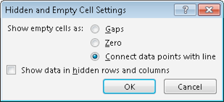
Figure 89-2:
The Hidden and Empty Cell Settings dialog box.
 Normally, a chart doesn’t display data that’s in a hidden row or column. You can use the Hidden and Empty Cell Settings dialog box to force a chart to use hidden data, though.