101 Excel 2013 Tips, Tricks and Timesavers (36 page)
Read 101 Excel 2013 Tips, Tricks and Timesavers Online
Authors: John Walkenbach

Tip 90: Using High-Low Lines in a Chart
Excel supports a number of stock market charts, which are normally used to display stock market data. For example, you can create a chart that shows a stock’s daily high, low, and closing prices. That particular chart type requires three data series.
But stock market charts aren’t just for stock prices. Figure 90-1 shows a chart that depicts daily temperatures for a month. The vertical lines (called
high-low lines
) show the temperature range for the day.
This chart was created with a single command. I selected the range A3:D34, chose Insert⇒Charts
➜
Other Charts, and selected the High-Low-Close option. You can, of course, format the high-low lines any way you like. And you may prefer to have the average temperatures connected with a line.
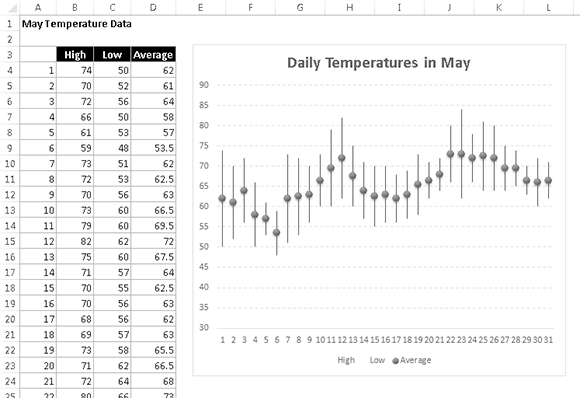
Figure 90-1:
Using a stock market chart to plot temperature data.
When creating stock market charts, the order of the data for the chart series is critical. Because I chose the High-Low-Close chart type, the series must be arranged in that order. In this case, the “Close” data corresponds to Average temperatures.
Tip 91: Using Multi-Level Category Labels
Most users don’t realize it, but when you create a chart, you can display multi-level category labels. You don’t have to do anything special. Just select all of the data before you create the chart. Excel takes care of the details for you.
Figure 91-1 shows an example of a chart that uses two columns for the category labels. Here, the first level is the region, and the second level is the state. Notice that the Region labels in column A aren’t repeated for each state. The blank regions cause the region name to appear once in the chart.
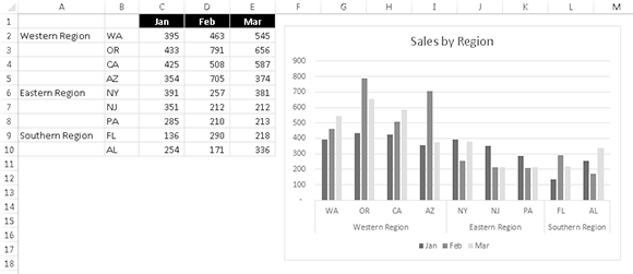
Figure 91-1:
A chart that uses two columns for category labels.
Figure 91-2 shows another example, which uses three columns for the category axis labels. In this example, the additional lines of text are used to provide more information about each of the four branches.
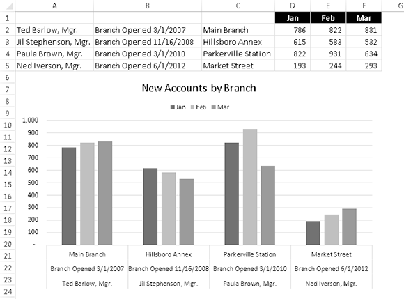
Figure 91-2:
A chart that uses three columns for category labels.
You can apply formatting to the category axis labels, but the formatting is applied to all of the text. In other words, you can’t apply different formatting for each level.
Figure 91-3 shows a variation of the previous example. After creating the chart with a multi-level category axis, I selected the category axis and pressed Ctrl+1 to display the Format Axis task pane. In the Axis Options⇒Labels section, I specified the Label Position to be High. I also deselected the Multi-level Category Labels option, which has the effect of making the lines closer together.
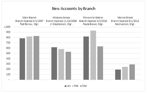
Figure 91-3:
A chart that displays category labels at the top.
Tip 92: Linking Chart Text to Cells
When you create a chart, you may want to have some of the chart’s text elements linked to cells. That way, when you change the text in the cell, the corresponding chart element is updated. You can even link chart text elements to cells that contain a formula. For example, you might link the chart title to a cell that contains a formula that returns the current date.
You can create a link to a cell for the chart title, the axis titles, and individual data labels.
1.
Select the chart element that will contain the cell link.
2.
Click the Formula bar.
3.
Type an equal sign (
=
).
4.
Click the cell that will be linked to the chart element.
5.
Press Enter.
Figure 92-1 shows a chart title being linked to cell A1.
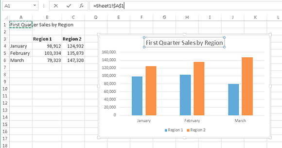
Figure 92-1:
Adding a cell link to a chart title.
 Oddly, this technique doesn’t work if the cell has a name. Excel displays an error claiming that the formula contains an error. If you must link the chart element to a named cell, override the name with the sheet name and cell address. For example:
=Sheet1!A12
In addition, you can add a linked text box (or a linked shape) to a chart:
1.
Select the chart.
2.
Choose Insert⇒Text⇒Text Box. Or choose Insert⇒Illustrations⇒Shapes and choose a shape that supports text.
3.
Click inside the chart to add an empty text box (or shape).
4.
Click the Formula bar.
5.
Type an equal sign (
=
).
6.
Click the cell that will be linked to the object.
7.
Press Enter.
Tip 93: Freezing a Chart
Normally, an Excel chart uses data stored in a range. Change the data, and the chart is updated automatically. Usually, that’s a good thing. But sometimes you want to “unlink” the chart from its data range to produce a
static
chart — a snapshot of a chart that never changes. For example, if you plot data generated by various what-if scenarios, you may want to save a chart that represents a baseline so that you can compare it with other scenarios. You can freeze a chart in two ways:
→ Convert the chart to a picture.
→ Convert the range references to arrays.
Converting a chart into a picture
To convert a chart to a static picture, follow these steps:
1.
Create the chart as usual and format it the way you want.
2.
Click the chart to activate it.
3.
Choose Home⇒Clipboard⇒Copy⇒Copy As Picture.
The Copy Picture dialog box appears.
4.
Accept the default settings and click OK.
5.
Click any cell to deselect the chart.
6.
Press Ctrl+V to paste the picture at the cell you selected in Step 5.
The result is a picture of the original chart. This chart can be edited as a picture, but not as a chart. In other words, you can no longer modify properties such as chart type and data labels. It’s a dead chart — just what you wanted.
When you select the picture, Excel displays its Picture Tools contextual menu. You can use all of the tools in Picture Tools⇒Format, plus those available in the Format Picture dialog box (displayed when you press Ctrl+1). Figure 93-1 shows a few examples of picture styles applied to a chart that was copied as a picture.
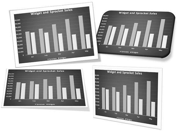
Figure 93-1:
Applying picture styles to a chart that was copied as a picture.
Converting range references into arrays
The other way to unlink a chart from its data is to convert the SERIES formula range references to arrays. Follow these steps:
1.
Activate your chart.
2.
Click a chart series.
The Formula bar displays the SERIES formula for the selected data series.
3.
Click the Formula bar.
4.
Press F9 and then press Enter.
Repeat these steps for each series in the chart.
Figure 93-2 shows a pie chart that has been unlinked from its data range. Notice that the Formula bar displays arrays, not range references. The original data SERIES formula was
=SERIES(,Sheet3!$A$1:$A$6,Sheet3!$B$1:$B$6,1)