The New Drawing on the Right Side of the Brain (49 page)
Read The New Drawing on the Right Side of the Brain Online
Authors: Betty Edwards

BOOK: The New Drawing on the Right Side of the Brain
3.27Mb size Format: txt, pdf, ePub
But what is all this color for? In the natural world of animals, birds, and plants, color always has a purpose—to attract, repel, conceal, communicate, warn, or assure survival. For present-day humans, has color even begun to lose its purpose and meaning? Now that we have this huge bulk of manufactured color, is its use mostly indiscriminate? Or is purpose and meaning still subliminally inherent in color as a remnant of our biological heritage? Is the pencil I write with painted yellow for a purpose? Did I choose to wear blue today for a reason?
And what is color? Is it merely, as scientists tell us, a subjective experience, a mental sensation that can only occur if three requirements are fulfilled: that there is an observer, an object, and sufficient light in the narrow band of wavelengths called the “visible spectrum”? It certainly is true that at twilight the world turns to shades of gray. Is the world really colorless, only seeming to become full of color again when we turn the lights on?
If color is a mental sensation, how does it happen? Scientists tell us that when light falls on an object—for example, an orange—the surface of the orange has the particular property of absorbing all the wavelengths of the spectrum except that which, when reflected back to our eyes and processed through the visual system, causes the mental sensation we have named the color “orange.” My writing pencil is coated with a chemical substance (paint) that absorbs all wavelengths except that which, when reflected back to my eyes, is “yellow.” Is the orange really orange? Is the pencil really yellow? We cannot know, because we cannot get outside of our own eye/brain/mind system to find out. What we do know is that when the sun goes down, color disappears.
Placing color in the brainGiven sufficient light to perceive colors, scientists also tell us that the brain’s reaction to colors seems to depend on the differences in thinking modes of the various sections of the brain.
Very bright, intense colors (and colors that shine and glitter) draw a response from the so-called “primitive” brain, the limbic system. This response is an emotional one, perhaps connected to our biological heritage of color as communication. For example, many people say, “When I get mad, I see red!” The inverse of this exclamation perhaps describes the situation whereby an intense red elicits an emotional, aggressive response.
The main role of L-mode, generally located in the left hemisphere, is to tag colors with names and attributes, such as “bright blue,” “lemon yellow,” or “burnt umber,” and to translate into words our emotional reactions to colors. (As an example, read in the marginal note how the Irish-Greek writer Lafcadio Hearn translated into words his emotional reactions to the color blue.)
Additionally, L-mode is specialized for designating sequenced steps in mixing colors—for example, “to mix orange, add yellow to red,” or “to darken blue, add black.”
The right hemisphere (or R-mode) is specialized for the perception of relationships of hues, particularly for subtle linkages of one hue to another. R-mode is biased toward discovering patterns of coherence, specifically toward combinations of hues that balance opposites—for example, red/green, blue/orange, dark/ light, dull/bright.
In his 1976 essay “The Dialectics of Color,” Dr. Peter Smith states: “Since the right hemisphere has a strong interest in the way things fit together to form a closed system, it may be said to be a decisive factor in the esthetic response.” This closed system may be what artists speak of as unified, harmonious color—that is, color in relationships that are locked into balance. Perhaps R-mode recognizes the satisfying wholeness of properly unified color and reacts with a pleasurable sense of “Yes. That’s it. That’s right.”
The converse is also true: R-mode recognizes unbalanced or disunified color arrangements and perhaps longs for unity and the missing parts of the closed system. An individual may experience this longing as vague dislike—a sense that something is missing or out of place.
R-mode has another important role in color: seeing which combination of colors has produced a particular color. Given a range of grays, for example, R-mode sees which one is warmed with red, which is cooled with blue.
Learning the basics of colorNearly everyone is interested in color, yet most people have surprisingly little comprehensive knowledge about it. We often take it for granted that we know enough about color to know what we like, and we feel that’s sufficient. Yet knowing something of the enormous body of knowledge about color increases pleasure in color, as in almost every subject. In the following pages, you will add a few color skills to your newly acquired basic perceptual skills of drawing.
Something odd happens when a student of drawing begins to add color to the gray, black, and white of drawing. No matter how satiated by our modern color-loaded surroundings, students focus on color as though seeing it for the first time, almost with the naive pleasure of children. And color in drawing does indeed add a tremendous emotional charge to drawing. For an example of this, compare Edgar Degas’s drawing of the ballet dancer on pink paper (Figure 11-6) with the almost identical Degas drawing on page 157 of Chapter Eight. But I must caution you: I am not saying that color makes a drawing better. It doesn’t. Color changes drawing, adding an element of drama and verve that moves it closer to painting.
For the basic exercises described in this chapter, you will need to buy a few new drawing supplies. I will add to the list of supplies as each technique is introduced.
First, buy a set of colored pencils. “Prismacolor” is a good brand, but there are many others. Prismacolor offers a complete set of sixty pencils, or you can buy individual colors. I suggest the following:
black
white
ultramarine blue
Copenhagen blue
dark green
canary yellow
scarlet red
magenta
sienna brown
dark brown
sepia
burnt umber
yellow ochre
lemon yellow
flesh
olive green
vermilion
violet
slate gray
sand
warm gray light
warm gray medium
cream
orange
white
ultramarine blue
Copenhagen blue
dark green
canary yellow
scarlet red
magenta
sienna brown
dark brown
sepia
burnt umber
yellow ochre
lemon yellow
flesh
olive green
vermilion
violet
slate gray
sand
warm gray light
warm gray medium
cream
orange
Also, buy six sheets of colored paper at least 9” x 12” or larger. Construction paper is fine, or you may prefer another type of paper. Any colored paper that is not too smooth or shiny will do. Avoid bright, intense colors. Choose instead soft green, gray,
sand, blue, brown, or, as in Degas’s dancer, soft pink. You will need a plastic eraser and a kneaded eraser. Buy a hand-held pencil sharpener, or a small knife if you prefer to hand-sharpen your pencils.
A wheel of color“Perhaps the most important point I can make is that you are not to think of painting as something separate from drawing.”
—Kimon Nicolaides
The Natural Way to Draw,
1941
The Natural Way to Draw,
1941
Some basic information about color:
The three main attributes of color are:
hue
value
intensity
Hue
is simply the name of the color. This is the L-mode attribute.
is simply the name of the color. This is the L-mode attribute.
Value
is the lightness or darkness of a hue, relative to the value scale. Value is an R-mode attribute.
is the lightness or darkness of a hue, relative to the value scale. Value is an R-mode attribute.
Intensity
is the brightness or dullness of a hue,
relative
to the utmost brightness available in pigments—generally color straight out of the tube. Intensity is an R-mode attribute.
is the brightness or dullness of a hue,
relative
to the utmost brightness available in pigments—generally color straight out of the tube. Intensity is an R-mode attribute.
To balance color, remember the following:
Every hue has its complement.
For every hue of a given intensity, there is the same hue at the opposite intensity.
For every hue of a given value, there is the same hue at the opposite value.
Starting with rock-bottom basics, make a color wheel. The thought of this probably takes you right back to sixth grade, but let me assure you that some of the best minds in human history have delved into color wheels—for example, the great English physicist and mathematician Isaac Newton and the German poet and scholar Johann Goethe.
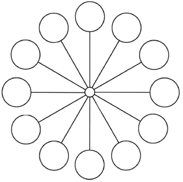
Fig. 11-1. For the arrangement of colors, see Fig. 11-2.
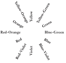
Fig. 11-2.
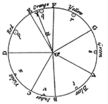
The color circle of Newton, 1704.
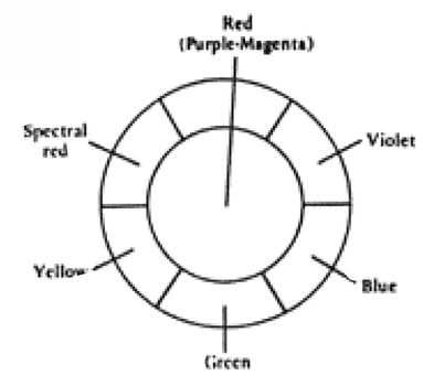
The color circle of Goethe, 1810.
What is the purpose of constructing a color wheel? Simply put, to set in your mind the structure of color. The three primary hues—yellow, red, and blue—are the basic building blocks of color. Theoretically, all other colors are derived from these three. Next come the three secondary hues—orange, violet, and green—born of primary parents. And then follows the third generation, the six tertiary (third-level) hues—yellow-orange, red-orange, red-violet, blue-violet, blue-green, and yellow-green. The color wheel has a total of twelve hues, arranged like the numbers on the face of a clock.
Use your colored pencils to match the color wheel (Figure 11-3) in the color section. You can trace the pattern in Figure 11-1 onto a piece of bond paper, or you can color directly on the pattern in the book. Bear down hard with your colored pencils to produce the most intense hues possible.
“Hues which approach red have almost universally been considered as warm colors and those which tend toward blue as cool. Fire and sunlight and the glow of brisk circulation of blood are all associated with warmth.
“The colors of the sky and distant mountains and cool waters are generally bluish. When the body is chilled its color tends toward a bluish hue. These reasons naturally make us associate red, orange, and yellow with warmth, and blue, blue-green, and blue-violet with coolness.”
—Walter Sargeant
The Enjoyment and Use of
Color,
1923
The Enjoyment and Use of
Color,
1923
Psychologist Guy T. Buswell, in his 1935 study,
How People Look at Pictures,
noted that although initial fixation tends to be roughly in the center of a painting, the eye generally moves first to the left and then to the right. Dr. Buswell speculated that this is a carry-over from reading.
How People Look at Pictures,
noted that although initial fixation tends to be roughly in the center of a painting, the eye generally moves first to the left and then to the right. Dr. Buswell speculated that this is a carry-over from reading.
Russian artist Wassily Kandinsky agreed with Buswell about center-to-left-to-right scanning, but disagreed about the reason. Kandinsky’s explanation:
“The picture is facing us, therefore its sides are reversed. Just as when we meet someone, we shake their right hand—which is on the left as we face each other.”
Kandinsky continued: “The left side of an image is dominant, therefore, just as our right hand is (usually) the leading or strongest hand.”
—W. Kandinsky
Point and Line to Plane,
1945
Point and Line to Plane,
1945
Other books
Fire Stones (The Fire Wars #2) by Gow, Kailin
Beneath the Surface by Heidi Perks
Rebel by Heather Graham
The Rapture by Liz Jensen
Relentless by Douglas, Cheryl
All I've Ever Wanted by Adrianne Byrd
June Bug by Jess Lourey
What Might Have Been: Daniels Brother #4 (Daniels Brothers) by Sherri Hayes
The Song is You (2009) by Arthur Phillips
Katie's Journey to Love by Jerry S. Eicher