The New Drawing on the Right Side of the Brain (53 page)
Read The New Drawing on the Right Side of the Brain Online
Authors: Betty Edwards

BOOK: The New Drawing on the Right Side of the Brain
6.05Mb size Format: txt, pdf, ePub
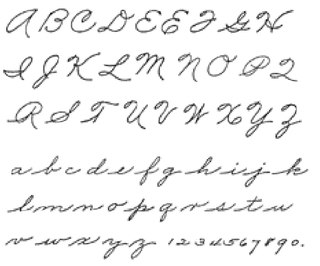
The Palmer method drill.
Next, I searched the university library: indexes of books on art education, drawing, and brain function—again, nothing. Early education books, of course, had entries on teaching the alphabet letters and words, and I found a few books specifically on handwriting—most of them published in England, where handwriting skills apparently still receive considerable attention. When I opened these books and skimmed through them, however, I was struck by my immediate reaction of sinking dismay at the tedium of the exercises. All of the worst aspects of public education came flooding back to me as memories of boring tasks, boringly taught, with no possibility of escape.
And yet I know that handwriting is important, and the group response I described above indicates that others feel that way too. In fact, of all the ways we express ourselves nonverbally, none is quite so personal as our handwriting—so personal and important that our signatures are legally protected as a mark of identity. Unlike other ways we use to express our individuality, we have sole ownership of our handwriting. It is a personal possession that no other person is allowed to use or imitate.
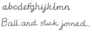
In past centuries, handwriting was considered an art. Every school had its master or mistress of penmanship, and in the nineteenth century much time and attention was consumed in perfecting the extravagant loops and swirls of Copperplate script. In America in the early decades of this century, our schoolchildren assiduously studied the venerable Palmer method, derived from a beautiful Spencerian script. By the late 1930s, however, the Palmer method had given way to an unlovely manuscript printing called “ball-and-stick” lettering for very young children, with a shift from lettering to cursive, or “real,” writing by around fourth grade. This shift was mainly a matter of making joining marks between the “ball-and-stick” letters.
Responding to educational theories in the 1940s and 1950s about encouraging individuality and avoiding rote learning, teachers encouraged each child to use the style of writing that felt comfortable, within limits of legibility and correctness of letter forms. Children had a choice of size and slant of letters, sometimes even the choice of staying with printing, and teachers expected that each child’s handwriting would more or less settle down to a legible form. Beauty was not an issue. Legibility was sufficient.
But writing is an art form. Using line, one of the most basic elements of art, handwriting can function as a means of artistic self-expression. Like drawing, handwriting employs certain conventional forms that have agreed-upon meanings. Over centuries, the letters of the alphabet have evolved into shapes of great beauty that communicate verbally, yet at the same time can convey subtle nonverbal intentions and reflections of the mind of the writer/artist. This is what we have lost. In my opinion, legibility is not enough. Educational theorists have sold handwriting short.
Can we regain this lost art? I think we can, by linking writing once again to the esthetic purposes of drawing. There is little difference between making a drawing in line and “draw ing” a signature, sentence, or paragraph. The purpose is the same: to convey information about the subject and to express the personality of the writer/artist. This nonverbal expression is subconsciously perceived and understood by the reader/viewer. Consider what William Reed, an expert on Japanese calligraphy, has to say:
Shodo
paintings [cursive calligraphy] are like pictures of the subconscious mind. They are not final statements, but rather instant snapshots of the personality at the time of writing. That personality can be developed and strengthened through
Ki
practice. On the other hand, careless calligraphy is also a form of practice, reinforcing bad habits and stunting the growth of the personality.
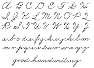
The Palmer method is joined, looped, and linked.
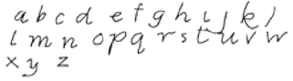
Ball-and-stick letters are round, unjoined, and upright.
This is surely the low-water mark of handwriting—awkward to the hand, without flow, and totally unrelated to the historical development of handwriting.

Have soft eyes and a gentle manner.
Shodo painting by William Reed.
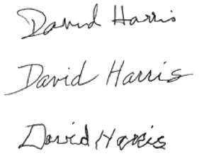
Write your signature three times. First, your usual signature; next, your best “hand”; last, your “odd hand” signature.
While we may never attain the disciplined aesthetic of the Oriental mind, surely we can bring beauty back into handwriting—not the ornate beauty of past centuries, but rather a modern beauty of ease, clarity, and coherence. I will recommend a few general principles and a few exercises, and I will hope against hope that you won’t get that awful sinking feeling of boredom. I urge you, at the least, to give the exercises a try.
The basic perceptual skills of writing/ drawing1. First, review the short section on handwriting in Chapter Two. Then, on a sheet of plain paper, write your signature just as you usually sign your name.
2. Underneath that signature, write your name again, this time using your most beautiful “hand.” Write slowly, drawing the letters with care.
3. Last, write your name one more time underneath the second version. This time, however, use the other hand: If you are right-handed, use your left hand, and if left-handed, use your right hand.
Now, compare these three “drawings.” The line expresses everything, and the communication is very clear. All you have to do is ask yourself, “If three people of equal qualifications were to apply for a position and these were their signatures, who would get the job?”
To improve your handwriting, therefore, the first step is to decide that it
does
matter; your writing sends a distinct message. The next step is to think about what message you want to convey. Reliability? Intelligence? Masculinity? Femininity? Humor? Sophistication? Clarity? (These, of course, are all positive messages. Writing can also convey such negative messages as carelessness, indifference, deviousness, laziness, instability, and egotism. But I’ll assume you won’t choose one of these qualities.)
Keeping
style
in mind as a final goal, let us see how the perceptual skills of drawing can help your handwriting to become more beautiful.
Drawing the contours of the alphabetstyle
in mind as a final goal, let us see how the perceptual skills of drawing can help your handwriting to become more beautiful.
1. The perception of edges: Try a Pure Contour Drawing of your handwriting. Tape a piece of paper down. Choose a pen or pencil that you like, with the width of line that feels comfortable to you. Turn away from the taped-down paper, so that it is out of sight. Holding the pen or pencil, place your writing hand on the paper and hold this book in the other hand, open to this page.


As children grow and change, so will their handwriting.
—Ornella Santoli
How to Read Handwriting
How to Read Handwriting
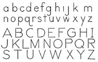
Christopher Jarman designed this alphabet with the aim of using simple, economical letters that can be written with any type of writing implement.
The “looped” style, based on the Palmer method.
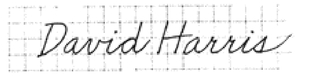
Student example of “pure” or “blind contour” handwriting.
Signature of George III, king of England.
An actual “blind contour” signature: George III, when blind.
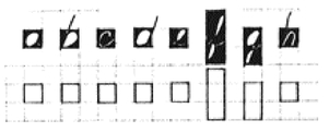
Negative-space letters.
Write your signature again. Using graph paper helps to see the negative spaces.
Other books
The Famished Road by Ben Okri
Strong Motion by Jonathan Franzen
The Family Corleone by Ed Falco
The Vampire Gene by Jenny Doe
Seducing the Sergeant by Carter, Mina
Sin With a Scoundrel: The Husband Hunters Club by Sara Bennett
Rockstar by Mina Carter
Toxic by Rachael Orman
PrimalDesign by Danica Avet
Yew Tree Gardens by Anna Jacobs