The New Drawing on the Right Side of the Brain (54 page)
Read The New Drawing on the Right Side of the Brain Online
Authors: Betty Edwards

BOOK: The New Drawing on the Right Side of the Brain
11.71Mb size Format: txt, pdf, ePub
2. Choose one of the alphabets illustrated here and copy each letter, first the lowercase, then the capitals. Draw each letter very slowly, millimeter by millimeter, at the same slow pace that your eyes move along the contours, paying attention to each detail and observing the beauty of each form.
3. When you have finished the alphabets, lowercase and capitals, write your name three times, very slowly, visualizing in your mind’s eye the ideal forms of the letters. Then, turn and look at your writing. I think you will be surprised. Even unable to see what you were writing, and even with the awkward position of Pure Contour Drawing, you will find your handwriting improved immediately, because
you were paying close attention to details of the letterforms.
Notice how beautifully spaced your letters are, and how you stayed “on the line,” even though you couldn’t see what you were doing.
you were paying close attention to details of the letterforms.
Notice how beautifully spaced your letters are, and how you stayed “on the line,” even though you couldn’t see what you were doing.
4. Next, using the technique of Modified Contour Drawing, repeat the exercise above. Place your plastic grid or a sheet of lined paper under your writing paper, to provide a guideline. Place this book where you can see the examples of alphabets. Choose one and copy it letter by letter, drawing very slowly. Then, write your signature again three times, or copy a few sentences from the text.
When you have finished:
Compare your last “drawings” with the first. You will have made progress already, simply by paying attention and slowing down.
Using the negative spaces of handwritingCompare your last “drawings” with the first. You will have made progress already, simply by paying attention and slowing down.
In Japanese as well as in European/American calligraphy, the negative spaces of the letters are as important as the lines we generally think of as constituting the letters. Examine the alphabets, first for
enclosed,
rounded negative spaces:
a, b, d, g , o, p, q.
enclosed,
rounded negative spaces:
a, b, d, g , o, p, q.
1. Practice these rounded negative spaces. Try not to think that you are drawing the letter
o,
for example. Think—decide!—that you are drawing the space inside and that it is a beautiful shape, embraced by the line with its precise closure. Write your signature again, paying special attention to any closed, rounded negative shapes.
o,
for example. Think—decide!—that you are drawing the space inside and that it is a beautiful shape, embraced by the line with its precise closure. Write your signature again, paying special attention to any closed, rounded negative shapes.
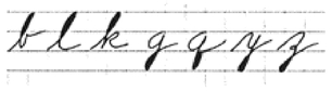
2. Next search the lowercase alphabets for closed, elongated negative shapes, some above the line, some below:
b, f, g , j, k, l, q, y, z.
Draw these letters now, again focusing on the negative shapes. Try to make all the closed, elongated negative shapes the same in size and in shape. Write your signature again, paying special attention to closed, elongated negative shapes.
b, f, g , j, k, l, q, y, z.
Draw these letters now, again focusing on the negative shapes. Try to make all the closed, elongated negative shapes the same in size and in shape. Write your signature again, paying special attention to closed, elongated negative shapes.
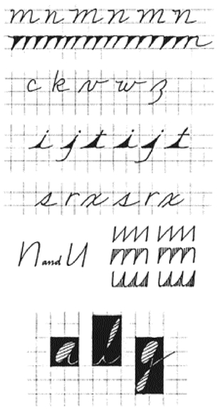
3. Continue with each of the main shapes of spaces—for example, the negative shape of
n, m, h, v, w, y.
These letters have
mounded
negative spaces. Draw a series of
m
’s and
n
’s, really concentrating on the negative mounds. Make each negative mound the same—same size, same shape.
n, m, h, v, w, y.
These letters have
mounded
negative spaces. Draw a series of
m
’s and
n
’s, really concentrating on the negative mounds. Make each negative mound the same—same size, same shape.
4. Try the
open
negative space of the letters
c, k, v, w,
and
z.
Check the margin model for the exact shape of these spaces.

open
negative space of the letters
c, k, v, w,
and
z.
Check the margin model for the exact shape of these spaces.
Fill in your loops to check their consistency of size.
Each letter needs its own negative space.
Decide on a slant, then use sighting to keep the slant consistent.
5. Try the pointed negative space of the letters
i, j, t.
Make sure that you place the dot over the
i
so that it precisely lines up with the tip of the letter.
i, j, t.
Make sure that you place the dot over the
i
so that it precisely lines up with the tip of the letter.
6. Try the negative shapes of the “odd” letters
s, r, x.
Note that each letter can be visualized in negative space in two ways: a. The interior negative spaces: the spaces inside the letters. b. The exterior negative spaces: the spaces outside the letters.
s, r, x.
Note that each letter can be visualized in negative space in two ways: a. The interior negative spaces: the spaces inside the letters. b. The exterior negative spaces: the spaces outside the letters.
For exterior negative spaces, imagine a format drawn around each letter. For the “short” lowercase letters, the basic format is a square. For letters with ascenders (“tall” letters), imagine a rectangle two boxes high, resting on the line. For letters with descenders (
g, y,
etc.), the two-box rectangle drops half of the rectangle below the line.
g, y,
etc.), the two-box rectangle drops half of the rectangle below the line.
The key point about the exterior negative spaces is that each letter needs its space (its format). Notice how the slanted letter fits inside the format. To practice exterior negative spaces, obtain a sheet of graph paper for ready-made formats.
Sighting a beautiful handIn art, the word
relationships
expresses a constant theme. As you have learned, art is relationship—parts brought into beautiful relationships with one another and with the whole, thus creating that most treasured attribute of art, unity. The same holds true for the art of handwriting. Precisely the same skills will shape your handwriting into closely related parts, fitted into a rhythmic, coherent,
unified
whole, thus creating beauty—beautiful handwriting.
Recall that in learning to draw, you learned the skill of perceiving relationships of angles (angles relative to the constants, vertical and horizontal) and proportions (in relation to one another). Let’s apply that skill to handwriting.
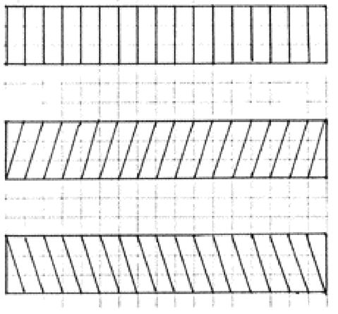
The main task is first to decide on a slant—an angle relative to vertical—and, second, to use the slant without deviation. This gives your handwriting a beautiful rhythm. More than any other aspect, consistent slant will give your writing coherence and unity.
It doesn’t really matter what angle you choose, but be aware that slant conveys a message, subconsciously understood by your reader. A slightly forward slant conveys energy and measured, forward action. A backward slant conveys caution, a conservative pace. An extreme forward slant conveys eagerness, or perhaps a bit of recklessness. Perfectly vertical writing conveys sobriety, a bias toward formality.
(Please be assured that these ideas are not taken from graphology. Graphologists have gone off into fanciful theories; for example, “Large loops on the letter
y
indicate that the writer is greedy, because the loops look like money bags.” This is nonsense.)
y
indicate that the writer is greedy, because the loops look like money bags.” This is nonsense.)
Slant of line is part of the language of art and, without question, the language of line used in handwriting is related to the principles of art—the basic precepts of composition, balance, movement, rhythm, and placement. Just as art expresses the intent of the artist, so does handwriting.
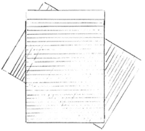
To practice consistent slant, place one sheet of ruled paper over another.

Decide on the proportions that are pleasing to you, then use them consistently.
In drawing, different styles of line have names: the bold line, the pure line, the repeated line, the lost-and-found line, the nervous line, the hard line, the soft line, and many others.
Consistency is the keyTo control consistency of slant and proportions, try the following exercises:
1. Place one sheet of lined paper over another, with the lines of the bottom sheet running vertically, at right angles to the horizontal lines of the top sheet. Adjust the bottom sheet until the angle seems right to you. (You may want to try several different slants.) Practice writing your signature, or copying a paragraph of text, aligning the slant to a perfectly consistent angle. At the same time, focus on forming the negative spaces of the letters.
2. The second part of sighting relationships is
sighting proportions.
In handwriting, this aspect is second in importance only to consistent slant. The main task is to decide on size relationships for your writing and to use the proportions consistently.
sighting proportions.
In handwriting, this aspect is second in importance only to consistent slant. The main task is to decide on size relationships for your writing and to use the proportions consistently.
Other books
Just Ask by Melody Carlson
Cowboy of Mine by Red L. Jameson
The Weather Wheel by Mimi Khalvati
Prester John by John Buchan
Stripping Her Defenses by Jessie Lane
Iron Wolf by Dale Brown
Sara's Mates by Wilde, Becky
Darkest Days: A Southern Zombie Tale by Layton, James J.
God's Battalions by Rodney Stark, David Drummond