The New Drawing on the Right Side of the Brain (26 page)
Read The New Drawing on the Right Side of the Brain Online
Authors: Betty Edwards

BOOK: The New Drawing on the Right Side of the Brain
4.06Mb size Format: txt, pdf, ePub
Visually—that is, as seen on the plane—a chair seat may appear as a narrow strip, not nearly wide enough to sit on. The legs may appear to be all of different lengths. The curve of the back of a chair may appear to be entirely different from what we know it to be (Figure 7-1).
What are we to do? An answer: Don’t draw the chair at all! Instead, draw the spaces of the chair.
Why does using negative space make drawing easier? I believe that it’s because you don’t know anything, in a verbal sense, about these spaces. Because you have no pre-existing memorized symbols for space-shapes, you can see them clearly and draw them correctly. Also, by focusing on negative spaces, you can cause L-mode again to drop out of the task, perhaps after a bit of protest: “Why are you looking at nothing? I do not deal with nothing! I can’t name it. It’s of no use . . . ” Soon, this chatter will cease—again, just what we want.
An analogy to clarify the concept of negative spacesIn drawing, negative space-shapes are real. They are not just empty “air.”
The following analogy may help you to see that. Imagine that you are watching a Bugs Bunny cartoon. Imagine that Bugs Bunny is running at top speed down a long hallway, at the end of which is a closed door. He smashes through the door, leaving a Bugs-Bunny shaped hole in the door. What’s left of the door is negative space. Note that the door has an outside edge (its format). This edge is the outside edge of the negative space-shape. In this analogy, the hole in the door is the positive form (Bugs Bunny) gone poof!
Now, take your Viewfinder/plastic Picture Plane and look at a chair. Close one eye and move the Viewfinder backward and forward, up and down, as though framing a snapshot. When you have found a composition that pleases you, hold the Viewfinder very still. Now, gazing at a space in the chair, perhaps the space between two back slats, imagine that the chair is magically pulverized and—like Bugs Bunny, in a poof!—disappears, leaving only the negative spaces, the one you are gazing at and all the rest of the spaces. They are real. They have real shapes, just like the remains of the door in the analogy above. These negative space-shapes are what you are going to draw. In short, you will draw the spaces, not the chair.
The reason? Recall our definition of edges: All edges are shared edges where two things come together. The negative spaces share edges with the (now absent) chair. If you draw the edges of the spaces, you also will have drawn the chair, because it shares edges with the spaces. But the chair will “look right,” because you will be able to see and draw the spaces accurately. (See the examples of negative-space drawings of chairs.)
Note that the format is also the outer edge of the chair’s negative spaces (another shared edge) and together the chair-form and the space-shapes fill the format completely. Technically speaking, the whole image, made up of positive forms and negative space-shapes, is called the composition. The artist composes the forms and the spaces within the format, arranging them according to certain “rules” called the Principles of Art.
Art teachers often laboriously try to teach their students “the rules of composition,” but I have discovered that if students pay close attention to negative spaces in their drawings, many compositional problems are automatically solved.
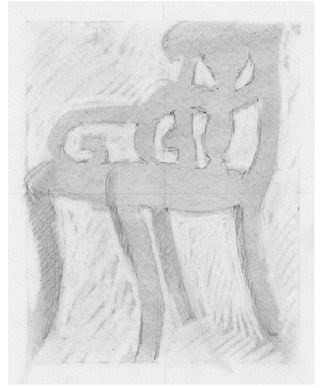
Demonstration drawing by instructor Brian Bomeisler.
Unity: A most important principle of art.
If negative spaces are given equal importance to the positive forms, all parts of a drawing seem interesting and all work together to create a unified image. If, on the other hand, the focus is almost entirely on the positive forms, the drawing may seem uninteresting and disunified—even boring—no matter how beautifully rendered the positive form may be. A strong focus on negative spaces will make these basic instructional drawings strong in composition and beautiful to look at.
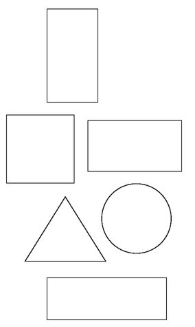
Fig. 7-2. A variety of formats.
Defining compositionIn drawing, the term composition means the way the components of a drawing are arranged by the artist. Some key components of a composition are positive shapes (the objects or persons), negative spaces (the empty areas), and the format (the relative length and width of the bounding edges of a surface). To compose a drawing, therefore, the artist places and fits together the positive shapes and the negative spaces within the format with the goal of unifying the composition.
The format controls composition. Put another way, the shape of the drawing surface (usually rectangular paper) will greatly influence how an artist distributes the shapes and spaces within the bounding edges of that surface. To clarify this, use your R-mode ability to image a tree, perhaps an elm or a pine. Now fit the same tree into each of the formats in Figure 7-2. You will find that—to “fill the space”—you have to change the shape of the tree and the spaces around the tree for each format. Then test again by imaging exactly the same tree in all of the formats. You will find that a shape that fits one format is all wrong for another.
Experienced artists fully comprehend the importance of the shape of the format. Beginning students in drawing, however, are curiously oblivious to the shape of the paper and the boundaries of the paper. Because their attention is directed almost exclusively toward the objects or persons they are drawing, they seem to regard the edges of the paper almost as nonexistent, almost like the real space that surrounds objects and has no bounds.
This obliviousness to the edges of the paper, which bound both the negative spaces and positive shapes, causes problems with composition for nearly all beginning art students. The most serious problem is the failure to unify the spaces and the shapes—a basic requirement for good composition.
The importance of composing within the formatIn Chapter Five, we saw that young children have a strong grasp of the importance of the format. Children’s consciousness of the bounding edges of the format controls the way they distribute the forms and spaces, and young children often produce nearly flawless compositions. The composition by a six-year-old in Figure 7-4 compares favorably with the Spanish artist Miro’s composition in Figure 7-3.

Fig. 7-3. Joan Miro,
Personages with Star
(1933). Courtesy of The Art Institute of Chicago.
Personages with Star
(1933). Courtesy of The Art Institute of Chicago.
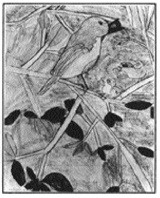
Fig. 7-4.
Unfortunately, as you have seen, this ability lapses as children approach adolescence, perhaps due to lateralization, increasing dominance of the language system, and the left hemisphere’s penchant for recognizing, naming, and categorizing objects. Concentration on things seems to supersede the young child’s more holistic or global view of the world, where everything is important, including the negative spaces of sky, ground, and air. Usually it takes years of training to convince students, in the way experienced artists are convinced, that the negative spaces, bounded by the format, require the same degree of attention and care that the positive forms require. Beginning students generally lavish all their attention on the objects, persons, or forms in their drawings, and then more or less “fill in the background.” It may seem hard to believe at this moment, but if care and attention are lavished on the negative spaces, the forms will take care of themselves. I’ll be showing you specific examples of that.
The quotations by the playwright Samuel Beckett and the Zen philosopher Alan Watts (on page 123) state this concept concisely. In art, as Beckett says, nothing (in the sense of empty space) is real. And as Alan Watts says, the inside and outside are one. You saw in the last chapter that in drawing, the objects and the spaces around them fit together like the pieces of a puzzle. Every piece is important and they share edges. Together they fill up all of the area within the four edges—that is, within the format.
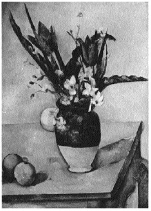
Look at the example of this fitting together of the spaces and shapes in the still-life painting by Paul Cézanne (Figure 7-6) and the figure drawing by Dürer (Figure 7-5). Notice how varied and interesting the negative spaces are. Even in the Dürer, which is almost symmetrical, the negative spaces are beautifully varied. Now, back to the drawing lessons.
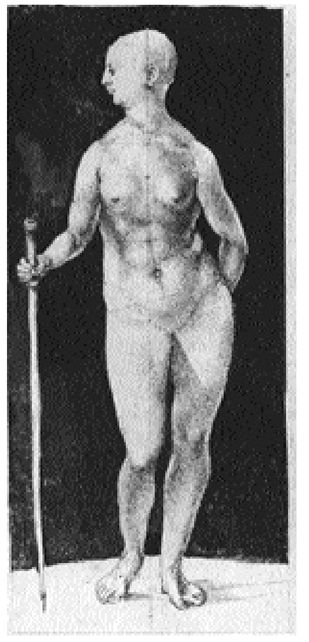
Fig. 7-5. Albrecht Dürer (1471-1528),
Nude Woman with a Staff
(1508). Courtesy of The National Gallery of Canada, Ottawa. The negative shapes surrounding the figure are beautifully varied in size and configuration.
Nude Woman with a Staff
(1508). Courtesy of The National Gallery of Canada, Ottawa. The negative shapes surrounding the figure are beautifully varied in size and configuration.
Other books
Dear Hank Williams by Kimberly Willis Holt
Guilty as Sin by Jami Alden
Under Zenith by Camp, Shannen Crane
Ansel Adams by Mary Street Alinder
Show Me by Carole Hart
Breathe You In by Lily Harlem
Duet by Eden Winters
Through the Storm by Maureen Lee
He Wanted the Moon by Mimi Baird, Eve Claxton
Fighting Gravity by Leah Petersen