CSS: The Definitive Guide, 3rd Edition (8 page)
Read CSS: The Definitive Guide, 3rd Edition Online
Authors: Eric A. Meyer
Tags: #COMPUTERS / Web / Page Design

Let's say you want to style the paragraph
immediately after a heading or give a special margin to a list that immediately
follows a paragraph. To select an element that immediately follows another element
with the same parent, you use the
adjacent-sibling
combinator
,
represented as a plus symbol (+). As with the
child combinator, the symbol can be surrounded by whitespace at the author's
discretion.
To remove the top margin from a paragraph immediately following anh1element, write:
h1 + p {margin-top: 0;}
The selector is read as, "selects any paragraph that immediately follows anh1element that shares a parent with thepelement."
To visualize how this selector works, it is easiest to once again consider a
fragment of a document tree, shown in
Figure
2-19
.

Figure 2-19. Another document tree fragment
In this fragment, a pair of lists descends from adivelement, one ordered and the other not, each containing three list
items. Each list is an adjacent sibling, and the list items themselves are also
adjacent siblings. However, the list items from the first list are
not
siblings of
the second, since the two sets of list items do not
share the same parent element. (At best, they're cousins.)
Remember that you can select the second of two adjacent siblings only with a
single combinator. Thus, if you writeli + li:
{font-weightbold;}, only the second
and third items in each list will be boldfaced. The first list items will be
unaffected, as illustrated in
Figure
2-20
.
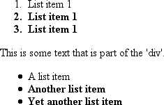
Figure 2-20. Selecting adjacent siblings
To work properly, CSS requires that the two elements appear in "source order." In
our example, anolelement is followed by aulelement. This allows you to select the
second element withol + ul, but you cannot select
the first using the same syntax. Forul + olto
match, an ordered list must immediately follow an unordered list.
In addition, text content between two elements does not prevent the
adjacent-sibling combinator from working. Consider this markup fragment, whose tree
view would be the same as that shown in
Figure
2-19
:
- List item 1
- List item 1
- List item 1
This is some text that is part of the 'div'.
- A list item
- Another list item
- Yet another list item
Even though there is text between the two lists, you can still match the second
list with the selectorol + ul. That's because the
intervening text is not contained with a sibling element, but is instead part of the
parentdiv. If you wrapped that text in a
paragraph element, it would then preventol + ulfrom matching the second list. Instead, you might have to write something likeol + p + ul.
As the following example illustrates, the adjacent-sibling combinator can be used
in conjunction with other combinators:
html > body table + ul{margin-top: 1.5em;}
The selector translates as "selects anyulelement that immediately follows a siblingtableelement that is descended from abodyelement that
is itself a child of anhtmlelement."
Internet Explorer for Windows through IE6 does not support child and
adjacent-sibling selectors. IE7 supports both.
Things get really interesting with
pseudo-class selectors
and
pseudo-element selectors
. These selectors let you assign styles
to structures that don't necessarily exist in the document, or to phantom classes that
are inferred by the state of certain elements, or even by the state of the document
itself. In other words, the styles are applied to pieces of a document based on
something other than the structure of the document, and in a way that cannot be
precisely deduced simply by studying the document's markup.
It may sound like I'm applying styles at random, but I'm not. Instead, I'm applying
styles based on somewhat ephemeral conditions that can't be predicted in advance.
However, the circumstances under which the styles will appear are, in fact,
well-defined. Think of it this way: during a sporting event, whenever the home team
scores, the crowd will cheer. You don't know exactly when during a game the team will
score, but when it does, the crowd will cheer, just as predicted. The fact that you
can't predict the moment of the cause doesn't make the effect any less expected.
Let's begin by examining pseudo-class selectors since they're better supported by
browsers and are therefore more widely used.
Consider the anchor element (a), which, in HTML
and XHTML, establishes a link from one document to another. Anchors are always
anchors, of course, but some anchors refer to pages that have already been visited,
while others refer to pages that have yet to be visited. You can't tell the
difference by simply looking at the HTML markup, because in the markup, all anchors
look the same. The only way to tell which links have been visited is by comparing the
links in a document to the user's browser history. So, there are actually two basic
types of anchors: visited and unvisited. These types are known as
pseudo-classes
, and the selectors that use them are called
pseudo-class selectors
.
To better understand these classes and selectors, consider how browsers behave
with regard to links. The Mosaic convention designated that links to pages you hadn't
visited were blue, and links to already visited pages were red (the red became purple
in succeeding browsers such as Internet Explorer). So, if you could insert classes
into anchors, such that any already visited anchor would have a class of, say,
"visited," then you could write a style to make such anchors red:
a.visited {color: red;}
W3C Web site
However, such an approach requires that the classes on anchors change every time
you visit a new page, which is a little silly. Instead, CSS defines pseudo-classes
that make the anchors to visited pages act as though they have classes of "visited":
a:visited {color: red;}
Now, any anchor that points to a visited page will be red, and you don't even have
to addclassattributes to any of the anchors.
Note the colon (:) in the rule. The colon
separating theaand thevisitedis the calling card of a pseudo-class or pseudo-element. All
pseudo-class and -element keywords are preceded by a colon.
pseudo-classes
CSS2.1 defines two pseudo-classes that apply
only to hyperlinks.
In HTML and
XHTML 1.0 and 1.1, these are anyaelements
with anhrefattribute; in XML languages,
they're any elements that act as links to another resource.
Table 2-2
describes these two
pseudo-classes.
Table 2-2. Link pseudo-classes
Name | Description |
|---|---|
| Refers to any anchor that is a hyperlink (i.e., has an |
| Refers to any anchor that is a hyperlink to an already visited |
The first of the pseudo-classes in
Table 2-2
may seem a bit redundant.
After all, if an anchor hasn't been visited, then it must be unvisited, right? If
that's the case, all we should need is the
following:
a {color: blue;}
a:visited {color: red;}
Although
this format seems reasonable, it's actually not quite enough. The first of the
rules shown here applies not only to unvisited links, but also to target anchors
such as this
one:
4. The Lives of Meerkats
The
resulting text would be blue because theaelement will match the rulea {color:blue;}, as shown above. Therefore, to avoid applying
your link styles to target anchors, use the:linkpseudo-class:
a:link {color: blue;}    /* unvisited links are blue */
a:visited {color: red;}   /* visited links are red */
As
you may have already realized, the:linkand:visitedpseudo-class selectors are
functionally equivalent to thebodyattributeslinkandvlink. Assume that an author wants all anchors to unvisited pages to be
purple and anchors to visited pages to be silver. In HTML 3.2, this could be
specified as
follows:
In
CSS, the same effect would be accomplished
with:
a:link {color: purple;}
a:visited {color: silver;}
In
the case of the CSS pseudo-classes, of course, you can apply more than just
colors. Let's say you want visited links to be italicized and to have, in addition
to their silver color, a strikethrough line, as shown in
Figure 2-21
.

Figure 2-21. Applying multiple styles to a visited link
This is simply done with the following
styles:
a:visited {color: silver; text-decoration: line-through; font-style: italic;}
This
is a good place to revisit class selectors and show how they can be combined with
pseudo-classes. For example, let's say you want to change the color of links that
point outside your own site. If you assign a class to each of these anchors, it's
easy:
My home page
Another home page
To
apply different styles to the external link, all you need is a rule like
this:
a.external:link, a.external:visited {color: maroon;}
This
rule will make the second anchor in the preceding markup maroon, while the first
anchor will remain the default color for hyperlinks (usually
blue).
The same general syntax is used for ID selectors as
well:
a#footer-copyright:link{font-weight: bold;}
a#footer-copyright:visited {font-weight: normal;}
Although:linkand:visitedare very useful, they're also static—they typically don't
change the styling of a document after its initial display. Other pseudo-classes
that aren't quite so static are available in CSS2.1; we'll review them
next.
pseudo-classes
CSS2.1 defines three pseudo-classes
that can change a document's appearance as a result of user behavior. These
dynamic pseudo-classes
have traditionally been used to style
hyperlinks, but the possibilities are much wider.
Table 2-3
describes these
pseudo-classes.
Table 2-3. Dynamic pseudo-classes
Name | Description |
|---|---|
| Refers to any element that currently has the input focus—i.e., |
| Refers to any element over which the mouse pointer is |
| Refers to any element that has been activated by user |
As with:linkand:visited, these pseudo-classes are most familiar in
the context of hyperlinks. Many web pages have styles that look like
this:
a:link {color: navy;}
a:visited {color: gray;}
a:hover {color: red;}
a:active {color: yellow;}
The
first two rules use static pseudo-classes, and the last two employ dynamic
pseudo-classes.:activeis analogous to thealinkattribute in HTML 3.2, although, as
before, you can apply color changes and any style you like to active
links.
The order of the pseudo-classes is more important than it might seem at
first. The usual recommendation is "link-visited-hover-active," although this
has been modified to "link-visited-focus-hover-active." The next chapter
explains why this particular ordering is important and discusses several
reasons you might choose to change or even ignore the recommended
ordering.
Notice that the dynamic pseudo-classes can be applied to any element,
which is good since it's often useful to apply dynamic styles to elements that
aren't links. For example, using this
markup:
input:focus {background: silver; font-weight: bold;}
you
could highlight a form element that is ready to accept keyboard input, as shown in
Figure 2-22
.
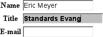
Figure 2-22. Highlighting a form element that has focus
You can also perform some rather odd feats by applying dynamic
pseudo-classes to arbitrary elements. You might decide to give users a "highlight"
effect by way of the
following:
body *:hover {background: yellow;}
This
rule will cause any element that's descended from thebodyelement to display a yellow background when it's in a hover
state. Headings, paragraphs, lists, tables, images, and anything else found inside
thebodywill be changed to have a yellow
background. You could also change the font, put a border around the element being
hovered, or alter anything else the browser will allow.
Internet Explorer for Windows through IE6 does not permit dynamic
pseudo-classes to select any elements other than hyperlinks. IE7 added support
for:hoveron any element, but not:focusstyles for form elements.
dynamic styling
Dynamic
pseudo-classes present some interesting issues and peculiarities. For example,
it's possible to set visited and unvisited links to one font size and make hovered
links a larger size, as shown in
Figure
2-23
:
a:link, a:visited {font-size: 13px;}
a:hover {font-size: 20px;}
Figure 2-23. Changing layout with dynamic pseudo-classes
As you can see, the user agent increases the size of the anchor while
the mouse pointer hovers over it. A user agent that supports this behavior must
redraw the document while an anchor is in hover state, which could force a reflow
of all the content that follows the link.
However, the CSS
specifications state that user agents are not required to redraw a document once
it's been rendered for initial display, so you can't absolutely rely on your
intended effect taking place. I strongly recommend that you avoid designs that
depend on such behavior.