CSS: The Definitive Guide, 3rd Edition (47 page)
Read CSS: The Definitive Guide, 3rd Edition Online
Authors: Eric A. Meyer
Tags: #COMPUTERS / Web / Page Design

There will be many cases when, having
determined where you're going to position an element, you'll want to declare how wide
and how high that element should be. In addition, there will likely be conditions
where you'll want to limit how high or wide a positioned element gets, not to mention
cases where you want the browser to go ahead and automatically calculate the width,
height, or both.
height
If you want to give your positioned element a
specific width, then the obvious property to use iswidth. Similarly,heightwill let
you declare a specific height for a positioned element.
Although it is
sometimes important to set the width and height of an element, it is not always
necessary when positioning elements. For example, if the placement of the four
sides of the element is described usingtop,right,bottom, andleft, then the height
and width of the element are implicitly determined by the offsets. Assume that you
want an absolutely positioned element to fill the left half of its containing
block, from top to bottom. You could use these values, with the result depicted in
Figure
10-28
:
top: 0; bottom: 0; left: 0; right: 50%;
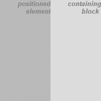
Figure 10-28. Positioning and sizing an element using only the offset properties
Since the default value of bothwidthandheightisauto, the result shown in
Figure 10-28
is exactly the same as if
you had used these
values:
top: 0; bottom: 0; left: 0; right: 50%; width: 50%; height: 100%;
The
presence ofwidthandheightin this example add nothing to the layout of the
element.
Of course, if you were to add padding, a border, or a margin
to the element, then the presence of explicit values forheightandwidthdo make a
difference:
top: 0; bottom: 0; left: 0; right: 50%; width: 50%; height: 100%;
padding: 2em;
This
will give you a positioned element that extends out of its containing block, as
shown in
Figure 10-29
.
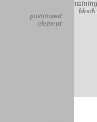
Figure 10-29. Positioning an element partially outside its containing block
This happens because, as we've seen in earlier chapters, the padding
is added to the content area, and the content area's size is determined by the
values ofheightandwidth. To get the padding you want and still have the element fit
into its containing block, you would either remove theheightandwidthdeclarations, or
else explicitly set them both toauto.
height
Should it become necessary or
desirable, you can place limits on an element's width by using the following CSS2
properties, which I'll refer to as the
min-max
properties
.
An element's content area can be defined to
have a minimum dimension usingmin-widthandmin-height.
min-width, min-height
- Values:
| | inherit- Initial value:
0- Applies to:
All elements except nonreplaced inline elements and table
elements- Inherited:
No
- Percentages:
Refer to the width of the containing block for
min-widthand the height of the containing block formin-height- Computed value:
For percentages, as specified; for length values, the absolute
length; otherwise,none
Similarly, an element's dimensions can be limited using the
propertiesmax-widthandmax-height.
max-width, max-height
- Values:
| | none|inherit- Initial value:
none- Applies to:
All elements except nonreplaced inline elements and table
elements- Inherited:
No
- Percentages:
Refer to the width of the containing block for
max-widthand the height of the containing block formax-height- Computed value:
For percentages, as specified; for length values, the absolute
length; otherwise,none
The names of these properties make them fairly self-explanatory.
What's less obvious at first, but makes sense once you think about it, is that no
values for these properties can be negative.
min-height,min-width,max-height, andmax-widthwere not supported by Internet
Explorer for Windows until IE7.
The following styles will force the positioned element to be at least
10em wide by 20em tall, as illustrated in
Figure
10-30
:
top: 10%; bottom: 20%; left: 50%; right: 10%;
min-width: 10em; min-height: 20em;
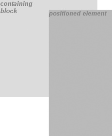
Figure 10-30. Setting a minimum and maximum height for a positioned element
This isn't a very robust solution since it forces the element to be at
least a certain size, regardless of the size of its containing block. Here's a
better
one:
top: 10%; bottom: auto; left: 50%; right: 10%; height: auto;
min-width: 15em;
Here
you have a case where the element should be 40 percent as wide as the containing
block but can never be less than 15em wide. You've also changed thebottomandheightso that they're automatically determined. This will let the element be as tall as
necessary to display its content, no matter how narrow it gets (never less than15em, of course!).
We'll look at the roleautoplays in theheightandwidthof positioned elements in the next section.
You can turn this around to keep elements from getting too wide or tall
by usingmax-widthandmax-height. Let's consider a situation where, for some reason, you
want an element to have three-quarters the width of its containing block, but to
stop getting wider when it hits 400 pixels. The appropriate styles
are:
left: 0%; right: auto; width: 75%; max-width: 400px;
One
great advantage of the min-max properties is that they let you mix units with
relative safety. You can use percentage-based sizes while setting length-based
limits, or vice versa.
It's worth mentioning that these min-max
properties can be very useful in conjunction with floated elements as well. For
example, you can allow a floated element's width to be relative to the width of
its parent element (which is its containing block), while also making sure that
the float's width never goes below 10em. The reverse approach is also
possible:
p.aside {float: left; width: 40em; max-width: 40%;}
This
will set the float to be 40em wide, unless that would be more than 40 percent of
the width of the containing block, in which case the float will be
narrowed.
We'll return to the subject of element sizing when discussing each type of
positioning.
If the content of an element is too much for the element's
size, it's in danger of overflowing the element itself. There are a few alternative
solutions in such situations, and CSS2 lets you select among them. It also allows you
to define a clipping region to determine the area of the element outside of which
these sorts of things become an issue.
So let's say that you have, for whatever reason, an
element that has been pinned to a specific size, and the content doesn't fit. You
can take control of the situation with theoverflowproperty.
overflow
- Values:
visible|hidden|scroll|auto|inherit- Initial value:
visible- Applies to:
Block-level and replaced elements
- Inherited:
No
- Computed value:
As specified
The default value ofvisiblemeans that the
element's content may be visible outside the element's box. Typically, this would
lead to the content simply running outside its own element box but not altering
the shape of that box. The following markup results in
Figure 10-31
:
div#sidebar {position: absolute; top: 0; left: 0; width: 25%; height: 7em;
background: #BBB; overflow: visible;}
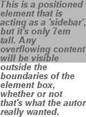
Figure 10-31. Content visibly
overflowing the element box
Ifoverflowis set toscroll, the element's content is clipped—that is,
cannot be seen—at the edges of the element box, but there is a way to make the
extra content available to the user. In a web browser, this could mean a scrollbar
(or set of them) or another method of accessing the content without altering the
shape of the element itself. One possibility, which could result from the
following markup, is depicted in
Figure
10-32
:
div#sidebar {position: absolute; top: 0; left: 0; width: 15%; height: 7em;
overflow: scroll;}

Figure 10-32. Overflowing content made available via a scroll mechanism
Ifscrollis used, the panning mechanisms
(e.g., scrollbars) should always be rendered. To quote the specification, "this
avoids any problem with scrollbars appearing or disappearing in a dynamic
environment." Thus, even if the element has sufficient space to display all of its
content, the scrollbars should still appear. In addition, when printing a page or
otherwise displaying the document in a print medium, the content may be displayed
as though the value ofoverflowwere declared
asvisible.
Ifoverflowis set tohidden, the element's content is clipped at the edges
of the element box, but no scrolling interface should be provided to make the
content outside the clipping
region accessible to
the user. Consider the following markup:
div#sidebar {position: absolute; top: 0; left: 0; width: 15%; height: 7em;
overflow: hidden;}
In such an instance, the clipped content would not be accessible to the user.
This would lead to a situation like that illustrated in
Figure 10-33
.
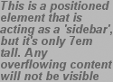
Figure 10-33. Clipping content at the edges of the content area
Finally, there isoverflow:auto. This allows user agents to determine which
behavior to use, although they are encouraged to provide a scrolling mechanism
when necessary. This is a potentially useful way to use overflow since user agents
could interpret it as "provide scrollbars only when needed." (They may not, but
they certainly could—and probably should.)
In situations where the content of an absolutely
positioned element overflows its element box, andoverflowhas been set such that the content should be clipped, it is
possible to alter the shape of the clipping region by using the propertyclip.
The default value,auto, means that the
contents of the element should not be clipped. The other possibility is to define
a clipping shape that is relative to the element's content area. This does not
alter the shape of the content area, but instead alters the area in which content
may be rendered.
clip
- Values:
rect(top,right,bottom,left)|auto|inherit- Initial value:
auto- Applies to:
Absolutely positioned elements (in CSS2,
clipapplied to block-level and replaced
elements)- Inherited:
No
- Computed value:
For a rectangle, a set of four computed lengths representing the
edges of the clipping rectangle; otherwise, as specified
While the only clipping shape available in CSS2 is a rectangle, the
specification does offer the possibility of other shapes being included in
future specifications.
This is accomplished with the shape valuerect(top,right,bottom,left). You could specify no change in the clipping
region like this:
clip: rect(0, auto, auto, 0);
The syntax ofrectis an interesting case.
Technically, it can berect(top,right,bottom,left)—note the commas—but the CSS2 specification
contains examples both with and without commas and definesrectas accepting both versions. Here, we'll stick to
the comma version mostly because it makes things easier to read, and because it's
preferred in CSS2.1.
It is extremely important to note that the values forrect(...)are
not
side-offsets. They are,
instead, distances from the upper-left corner of the element (or the upper-right,
in right-to-left languages). Thus, a clipping rectangle that encloses 20 ×
20-pixel square in the upper-left corner of the element would be defined as:
rect(0, 20px, 20px, 0)
The only values permitted withrect(...)are
length values andauto, which is the same as
setting the clipping edge to the appropriate content edge. Thus, the following two
statements mean the same thing:
clip: rect(auto, auto, 10px, 1em);
clip: rect(0, 0, 10px, 1em);
Because all of the offsets inclipare from
the top-left corner, and percentages are not permitted, it is practically
impossible to create a "centered" clipping area unless you know the dimensions of
the element itself. Consider:
div#sidebar {position: absolute; top: 0; bottom: 50%; right: 50%; left: 0;
clip: rect(1em,4em,6em,1em);}
Since there is no way to know how many ems tall or wide the element will be,
there is no way to define a clipping rectangle—which ends one em to the right, or
one em below, the content area of the element. The only way to know this is to set
the height and width of the element itself:
div#sidebar {position: absolute; top: 0; left: 0; width: 5em; height: 7em;
clip: rect(1em,4em,6em,1em);}
This would cause a result something like that shown in
Figure 10-34
, where a dashed line has
been added to illustrate the edges of the clipping region. This line would not
actually appear in a user agent attempting to render the document.
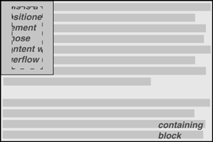
Figure 10-34. Setting the clipping region for overflowing content
It is possible to set negative lengths, though, which will expand the clipping
area outside the element's box. If you want to push the clipping area up and left
by a quarter-inch, use the following styles (illustrated in
Figure 10-35
):
clip: rect(-0.25in, auto, auto, -0.25in);
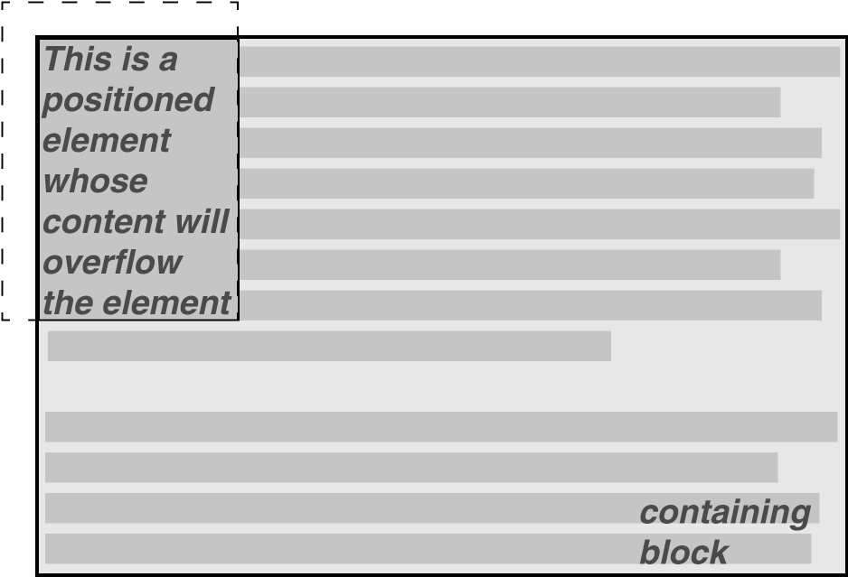
Figure 10-35. Extending the clipping region outside the element box
This doesn't do much good, as you can see. The clipping rectangle extends up
and to the left, but since there isn't any content there, it doesn't make much
difference.
On the other hand, it might be OK to go beyond the bottom and right edges, but
not the top or left.
Figure 10-36
shows the results of these styles (and remember, the dashed lines are only for
illustrative purposes!):
div#sidebar {position: absolute; top: 0; left: 0; width: 5em; height: 7em;
clip: rect(0,6em,9em,0);}
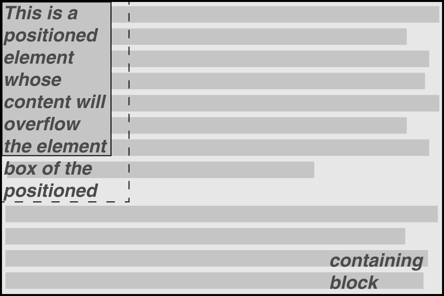
Figure 10-36. Extending the clipping region below and to the right of the element box
This extends the area in which content can be seen. However, it doesn't change
the flow of the content, so the only visual effect is that more content is visible
below the element. The text does not flow out to the right, because the width of
its line boxes is still constrained by the width of the positioned element. If
there had been an image wider than the positioned element, or preformatted text
with a long line, this might have been visible to the right of the positioned
element, up to the point where the clipping rectangle ends.
The syntax ofrect(...)is, as you may have
already realized, rather unusual when compared to the rest of CSS. It is based on
an early draft of the positioning section, which used the top-left-offset scheme.
Internet Explorer implemented this syntax before CSS2 was made a full
Recommendation, so it conflicted with a last-minute change that maderect(...)use side-offsets, just like the rest of
CSS2. This was done, reasonably enough, to make positioning consistent.
By then, however, it was too late: there was an implementation in the
marketplace, and rather than force Microsoft to change the browser and thus
potentially break existing pages, the standard was changed to reflect
implementation. Unfortunately, as we saw before, this means that it is impossible
to set a consistent clipping rectangle in situations where the height and width
are not precisely defined.
Further compounding the problem is thatrect(...)accepts only length units andauto. The addition of percentage units as validrect(...)values would go a long way toward improving
things, and hopefully a future version of CSS will add this capability.
The long and convoluted history ofclipmeans that, in current browsers, it acts in inconsistent ways and cannot be
relied upon in any cross-browser environment.