CSS: The Definitive Guide, 3rd Edition (43 page)
Read CSS: The Definitive Guide, 3rd Edition Online
Authors: Eric A. Meyer
Tags: #COMPUTERS / Web / Page Design

Setting colors and backgrounds on elements gives authors a great deal of power. The
advantage of CSS over traditional methods is that colors and backgrounds can be applied
to any element in a document—not just table cells, for example, or anything enclosed in
aFONTtag. Despite a few bugs in some
implementations, such as Navigator 4's reluctance to apply a background to the entire
content area of an element, backgrounds are very widely used properties. Their
popularity isn't too hard to understand, either, since color is one easy way to
distinguish the look of one page from another.
CSS allows for a great deal more in the way of element styling, however: borders that
can be placed on any element, extra margins and padding, and even a way to "float"
elements other than images. We'll get into these concepts in the next chapter.
Sure, CSS makes content look good with font changes, backgrounds, and all the rest, but
what about accomplishing basic layout tasks? Enter
floating
and
positioning
.
These are the tools by
which you can set up columnar layout, overlap one piece of layout with another, and
generally accomplish everything that so many tables have been used for over the years.
The idea behind positioning is fairly simple. It allows you to define exactly where
element boxes will appear relative to where they would ordinarily be—or relative to a
parent element, another element, or even to the browser window itself. The power of this
feature is both obvious and surprising. It shouldn't shock you to learn that user agents
support this element of CSS2 better than many others.
Floating, on the other hand, was first offered in CSS1, based on a capability that had
been added by Netscape early in the Web's life. Floating is not exactly positioning, but it
certainly isn't normal-flow layout either. We'll see exactly what this means later in the
chapter.
You are almost certainly acquainted
with the concept of floated elements.
Ever since
Netscape 1, it has been possible to float images by declaring, for instance,
image to float to the right and allows other content (such as text) to "flow around" the
image. The name "floating," in fact, comes from the document "Extensions to HTML 2.0,"
which stated:
The additions to your ALIGN options need a lot of explanation. First, the values
"left" and "right". Images with those alignments are an entirely new
floating
image type.
In the past, it was only possible to float images and, in some browsers, tables. CSS,
on the other hand, lets you float any element, from images to paragraphs to lists. In
CSS, this behavior is accomplished using the propertyfloat.
float
- Values:
left|right|none|inherit- Initial value:
none- Applies to:
All elements
- Inherited:
No
- Computed value:
As specified
For example, to float an image to the left, you could use this markup:

As
Figure 10-1
makes clear, the image
"floats" to the left side of the browser window, and the text flows around it. This is
just what you should expect.
Figure 10-1. A floating image
However, when floating elements in CSS, some interesting issues come up.
Keep a few things in mind with regard to floating elements.
First, a floated element is, in some ways, removed from the normal flow of the
document, although it still affects the layout. In a manner utterly unique within
CSS, floated elements exist almost on their own plane, yet they still have influence
over the rest of the document.
This influence derives from the fact that when an element is floated, other
content "flows around" it. This is familiar behavior with floated images, but the
same is true if you float a paragraph, for example. In
Figure 10-2
, you can see this effect quite
clearly, thanks to the margin added to the floated paragraph:
p.aside {float: right; width: 15em; margin: 0 1em 1em; padding: 0.25em;
border: 1px solid;}
Figure 10-2. A floating paragraph
One of the first interesting things to notice is that margins around floated
elements do not collapse. If you float an image with 20-pixel margins, there will be
at least 20 pixels of space around that image. If other elements adjacent to the
image—and that means adjacent horizontally
and
vertically—also
have margins, those margins will not collapse with the margins on the floated image,
as you can see in
Figure 10-3
:
p img {float: left; margin: 25px;}
Figure 10-3. Floating images with margins
To resurrect the paper-and-plastic analogy from
Chapter 7
, the plastic margins around an image
never
overlap the plastic surrounding other floated
elements.
If you do float a nonreplaced element, you must declare awidthfor that element. Otherwise, according to the CSS specification,
the element's width will tend toward zero. Thus, a floated paragraph could literally
be one character wide, assuming one character is the browser's minimum value forwidth. If you fail to declare awidthvalue for your floated elements, you could end up
with something like
Figure 10-4
. (It's
unlikely, granted, but still possible.)
Figure 10-4. Floated text without an explicit width
all
There is one other
value forfloatbesidesleftandright.float:noneis used to prevent an element from floating at
all.
This might seem a little silly, since the easiest way to keep an
element from floating is to simply avoid declaring a float, right? Well, first of
all, the default value offloatisnone. In other words, the value has to exist in order
for normal, nonfloating behavior to be possible; without it, all elements would
float in one way or another.
Second, you might want to override a
certain style from an imported style sheet. Imagine that you're using a
server-wide style sheet that floats images. On one particular page, you don't want
those images to float. Rather than writing a whole new style sheet, you could
simply placeimg {float:none;}in your document's embedded style sheet.
Beyond this type of circumstance, though, there really isn't much call to actually
usefloat:none.
Before we
start digging into details of floating, it's important to establish the concept of a
containing block
. A floated element's containing block is the
nearest block-level ancestor element. Therefore, in the following markup, the floated
element's containing block is the paragraph element that contains it:
Test

This is paragraph text, but you knew that.  Within the content of this
paragraph is an image that's been floated.

The containing block for the floated image is the paragraph.

We'll return to the concept of containing blocks when we discuss positioning
later in this chapter.
Furthermore, a floated element generates a block box, regardless of the kind of
element it is. Thus, if you float a link, even though the element is inline and would
ordinarily generate an inline box, it generates a block box when floated. It will be
laid out and act as if it were, for example, adiv. This is not unlike declaringdisplay:blockfor the floated element,
although it is not necessary to do so.
A series of specific rules govern the placement of a floated element, so let's
cover those before digging into applied behavior. These rules are vaguely similar to
those that govern the evaluation of margins and widths, and have the same initial
appearance of common sense. They are as follows:
The left (or right) outer edge of a floated element may not be to the left
(or right) of the inner edge of its containing block.This is straightforward enough. The outer left edge of a left-floated
element can only go as far left as the inner left edge of its containing block;
similarly, the furthest right a right-floated element may go is its containing
block's inner right edge, as shown in
Figure 10-5
. (In this and subsequent figures, the circled numbers
show the position of the markup element in relation to the source, and the
numbered boxes show the position and size of the floated visible element.)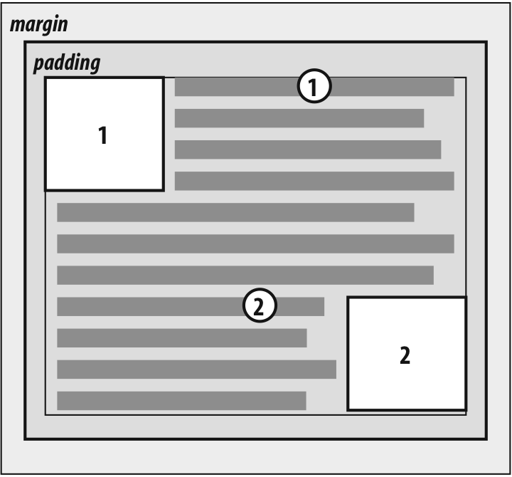
Figure 10-5. Floating to the left (or right)
The left (or right) outer edge of a floated element must be to the right (or
left) of the right (left) outer edge of a left-floating (or right-floating)
element that occurs earlier in the document's source, unless the top of the
later element is below the bottom of the former.This rule prevents floated elements from "overwriting" one another. If an
element is floated to the left, and another floated element is already there,
the latter element will be placed against the outer right edge of the
previously floated element. If, however, a floated element's top is below the
bottom of all earlier floated images, it can float all the way to the inner
left edge of the parent. Some examples of this behavior are shown in
Figure 10-6
.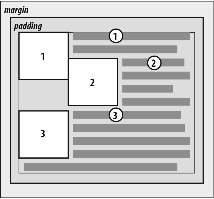
Figure 10-6. Keeping floats from overlapping
The advantage of this rule is that all your floated content will be visible
since you don't have to worry about one floated element obscuring another. This
makes floating a fairly safe thing to do. The situation is markedly different
when using positioning, where you could easily cause elements to overwrite one
another.The right outer edge of a left-floating element may not be to the right of
the left outer edge of any right-floating element to its right. The left outer
edge of a right-floating element may not be to the left of the right outer edge
of any left-floating element to its left.This rule prevents floated elements from overlapping one another.
Let's say you have abodythat is 500 pixels wide, and its sole content is two images
that are 300 pixels wide. The first is floated to the left, and the second is
floated to the right. This rule prevents the second image from overlapping the
first by 100 pixels. Instead, it is forced down until its top is below the
bottom of the left-floating image, as depicted in
Figure 10-7
.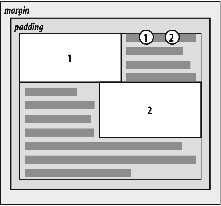
Figure 10-7. More overlap prevention
A floating element's top may not be higher than the inner top of its parent.
If a floating element is between two collapsing margins, it is placed as though
it had a block-level parent element between the two elements.The first part of this rule is quite simple and keeps floating elements from
floating all the way to the top of the document. The correct behavior is
illustrated in
Figure 10-8
. The
second part of this rule fine-tunes the alignment in situations—for example,
when the middle paragraph of three paragraphs is floated. In that case, the
floated paragraph is floated as if it had a block-level parent element (say, adiv). This prevents the floated paragraph
from moving up to the top of whatever parent the three paragraphs share.
Figure 10-8. Unlike balloons, floated elements can't float upward
A floating element's top may not be higher than the top of any earlier
floating or block-level element.Similar to Rule 4, Rule 5 keeps floated elements from floating all the way
to the top of their parent elements. It is also impossible for a floated
element's top to be any higher than the top of a floated element that occurs
earlier.
Figure 10-9
is an example
of this; here, you can see that since the second float was forced below the
first one, the third float's top is even with the top of the second float, not
the first.
Figure 10-9. Keeping floats below their predecessors
A floating element's top may not be higher than the top of any line box
containing a box generated by an element that comes earlier in the document
source.Similar to Rules 4 and 5, this rule further limits the upward floating of an
element by preventing it from being above the top of a line containing content
that precedes the floated element. Let's say that, right in the middle of a
paragraph, there is a floated image. The highest the top of that image may be
placed is the top of the line box from which the image originates. As you can
see in
Figure 10-10
, this keeps
images from floating too far upward.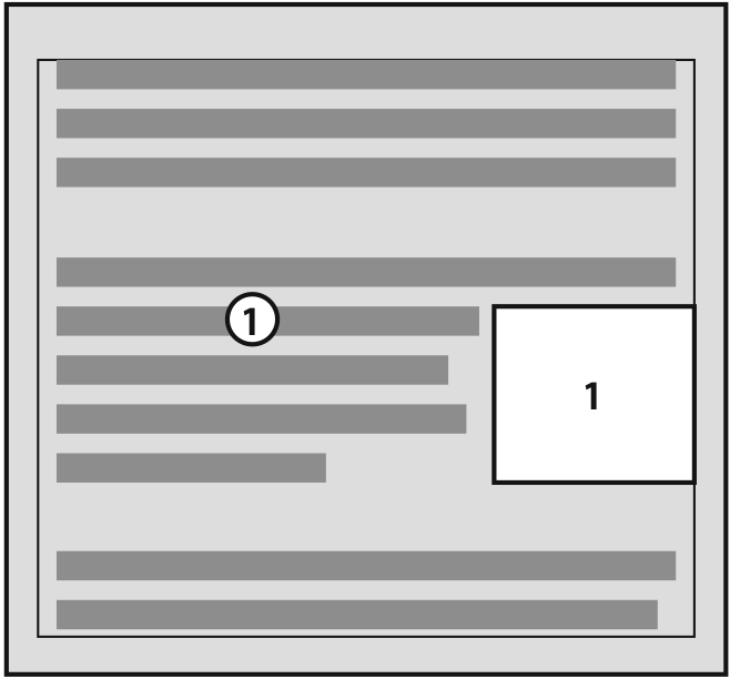
Figure 10-10. Keeping floats level with their context
A left (or right) floating element that has another floating element to its
left (right) may not have its right outer edge to the right (left) of its
containing block's right (left) edge.In other words, a floating element cannot stick out beyond the edge of its
containing element, unless it's too wide to fit on its own. This prevents a
situation where a succeeding number of floated elements could appear in a
horizontal line and far exceed the edges of the containing block. Instead, a
float that would otherwise stick out of its containing block by appearing next
to another one will be floated down to a point below any previous floats, as
illustrated by
Figure 10-11
(the
floats start on the next line in the figure to more clearly illustrate the
principle at work here). This rule first appeared in CSS2, to correct its
omission in CSS1.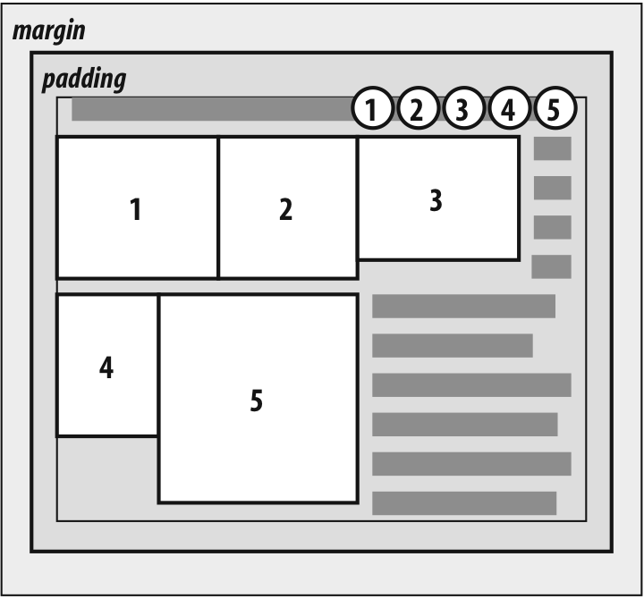
Figure 10-11. If there isn't room, floats get pushed to a new "line"
A floating element must be placed as high as possible.
Rule 8 is, of course, subject to the restrictions introduced by the previous
seven rules. Historically, browsers aligned the top of a floated element with
the top of the line box after the one in which the image's tag appears. Rule 8,
however, implies that its top should be even with the top of the same line box
as that in which its tag appears, assuming there is enough room. The
theoretically correct behaviors are shown in
Figure 10-12
.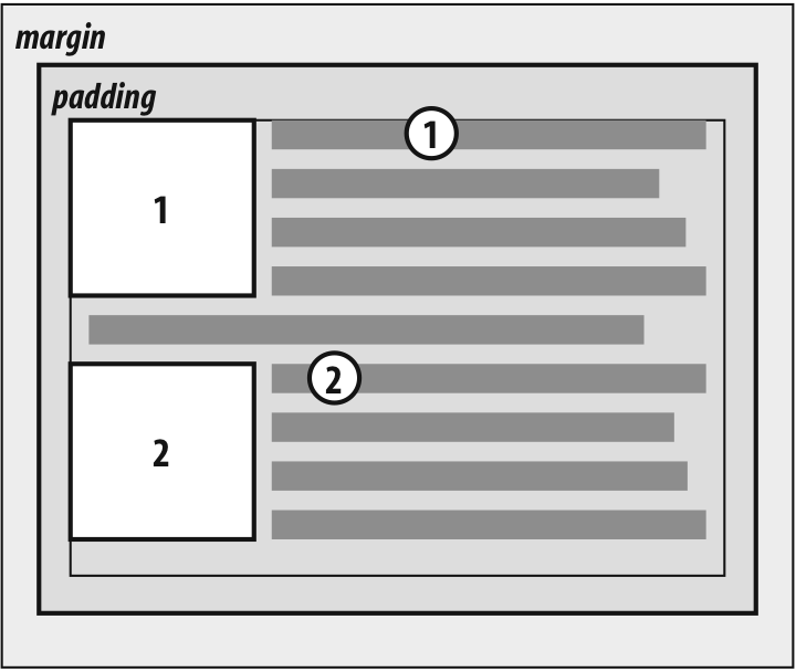
Figure 10-12. Given the other constraints, go as high as possible
WarningUnfortunately, since there is no precisely defined meaning for "as high
as possible" (which could mean, and in fact has been argued to mean, "as
high as conveniently possible"), you cannot rely on consistent behavior even
among browsers that are considered CSS1-conformant. Some browsers will
follow historical practice and float the image down into the next line,
while others will float the image into the current line if there is room to
do so.