CSS: The Definitive Guide, 3rd Edition (14 page)
Read CSS: The Definitive Guide, 3rd Edition Online
Authors: Eric A. Meyer
Tags: #COMPUTERS / Web / Page Design

If you've written web
pages, you're obviously familiar with URLs (or, in CSS2.1, URIs). Whenever you need to
refer to one—as in the@importstatement, which is
used when importing an external style sheet—the general format is:
url(protocol://server/pathname)
This example defines what is known as an
absolute URL
.
By absolute, I mean a URL that will work no matter where
(or rather, in what page) it's found, because it defines an absolute location in web
space. Let's say that you have a server called
www.waffles.org
. On that
server, there is a directory calledpix, and in this
directory is an image
waffle22.gif
. In this case, the absolute URL
of that image would be:
http://www.waffles.org/pix/waffle22.gif
This URL is valid no matter where it is found, whether the page that contains it is
located on the server
www.waffles.org
or
web.pancakes.com
.
The other type of URL is a
relative URL
,
so named because it specifies a location that is relative
to the document that uses it. If you're referring to a relative location, such as a file
in the same directory as your web page, then the general format is:
url(pathname)
This works only if the image is on the same server as the page that contains the URL.
For argument's sake, assume that you have a web page located at
http://www.waffles.org/syrup.html
and that you want the image
waffle22.gif
to appear on this page. In that case, the URL would
be:
pix/waffle22.gif
This path works because the web browser knows that it should start with the place it
found the web document and then add the relative URL. In this case, the pathname
pix/waffle22.gif
added to the server name
http://www.waffles.org
equals
http://www.waffles.org/pix/waffle22.gif
. You can almost always use an
absolute URL in place of a relative URL; it doesn't matter which you use, as long as it
defines a valid location.
In CSS, relative URLs are relative to the style sheet itself, not to the HTML
document that uses the style sheet. For example, you may have an external style sheet
that imports another style sheet. If you use a relative URL to import the second style
sheet, it must be relative to the first style sheet. As an example, consider an HTML
document at
http://www.waffles.org/toppings/tips.html
, which has alinkto the style sheet
http://www.waffles.org/styles/basic.css
:
href="http://www.waffles.org/styles/basic.css">
Inside the file
basic.css
is an@importstatement referring to another style sheet:
@import url(special/toppings.css);
This@importwill cause the browser to look for
the style sheet at
http://www.waffles.org/styles/special/toppings.css
,
not at
http://www.waffles.org/toppings/special/toppings.css
. If you have
a style sheet at the latter location, then the@importin
basic.css
should read:
@import url(http://www.waffles.org/toppings/special/toppings.css);
Netscape Navigator 4 interprets relative URLs in relation to the HTML document,
not the style sheet. If you have a lot of NN4.x visitors or want to make sure NN4.x
can find all of your style sheets and background images, it's generally easiest to
make all of your URLs absolute, since Navigator handles those correctly.
Note that there cannot be a space between theurland the opening parenthesis:
body {background: url(http://www.pix.web/picture1.jpg);}   /* correct */
body {background: url  (images/picture2.jpg);}          /* INCORRECT */
If the space isn't omitted, the entire declaration will be invalidated and thus
ignored.
For those times when a value needs to be described with a
word of some kind, there are keywords. A very common example is the keywordnone, which is distinct from0(zero). Thus, to remove the underline from links in an HTML document,
you would write:
a:link, a:visited {text-decoration: none;}
Similarly, if you want to force underlines on the links, then you would use the
keywordunderline.
If a property accepts keywords, then its keywords will be defined only for the
scope of that property. If two properties use the same word as a keyword, the
behavior of the keyword for one property will not be shared with the other. As an
example,normal, as defined forletter-spacing, means something very different than thenormaldefined forfont-style.
There is one keyword that is
shared by all properties in CSS2.1:inherit.inheritmakes the value of a property the
same as the value of its parent element. In most cases, you don't need to specify
inheritance, since most properties inherit naturally; however,inheritcan still be very useful.
For
example, consider the following styles and
markup:
#toolbar {background: blue; color: white;}
Thedivitself will have a blue background and a
white foreground, but the links will be styled according to the browser's
preference settings. They'll most likely end up as blue text on a blue background,
with white vertical bars between them.
You could write a rule that
explicitly sets the links in the "toolbar" to be white, but you can make things a
little more robust by usinginherit. You simply
add the following rule to the style
sheet:
#toolbar a {color: inherit;}
This
will cause the links to use the inherited value ofcolorin place of the user agent's default styles. Ordinarily, directly
assigned styles override inherited styles, butinheritcan reverse that behavior.
In addition to what we've covered in CSS2.1, CSS2 contains a few extra units, all of
which are concerned with aural style sheets (employed by those browsers that are capable
of speech). These units were not included in CSS2.1, but since they may be part of
future versions of CSS, we'll briefly discuss them here:
- Angle values
Used to define the position from which a given sound should originate. There
are three types of angles: degrees (deg),
grads (grad), and radians (rad). For example, a right angle could be declared
as90deg,100grad, or1.57rad; in each
case, the values are translated into degrees in the range 0 through 360. This
is also true of negative values, which are allowed. The measurement-90degis the same as270deg.- Time values
Used to specify delays between speaking elements. They can be expressed as
either milliseconds (ms) or seconds
(s). Thus,100msand0.1sare equivalent.
Time values cannot be negative, as CSS is designed to avoid paradoxes.- Frequency values
Used to declare a given frequency for the sounds that speaking browsers can
produce. Frequency values can be expressed as hertz (Hz) or megahertz (MHz) and
cannot be negative. The values' labels are case-insensitive, so10MHzand10Mhzare equivalent.
The only user agent known to support any of these values at this writing is
Emacspeak
,
an aural style sheets implementation. See
Chapter 14
for details on aural styles.
In addition to these values, there is also an old friend with a new name. A
URI
is a
Uniform Resource
Identifier
,
which is sort of another name for a Uniform Resource Locator (URL). Both the CSS2 and
CSS2.1 specifications require that URIs be declared with the formurl(...), so there is no practical change.
Units
and values cover a wide spectrum of areas, from length units to special keywords that
describe effects (such asunderline) to color units
to the location of files (such as images). For the most part, units are the one area
that user agents get almost totally correct, but it's those few little bugs and quirks
that can get you. Navigator 4.x's failure to interpret relative URLs correctly, for
example, has bedeviled many authors and led to an overreliance on absolute URLs. Colors
are another area where user agents almost always do well, except for a few little quirks
here and there. The vagaries of length units, however, far from being bugs, are an
interesting problem for any author to tackle.
These units all have their advantages and drawbacks, depending upon the circumstances
in which they're used. We've already seen some of these circumstances, and their nuances
will be discussed in the rest of the book, beginning with the CSS properties that
describe ways to alter how text is displayed.
As the authors of the CSS specification clearly recognized, font selection is a popular
(and crucial) feature. After all, how many pages are littered with dozens, or even
hundreds, of
beginning of the "Font Properties" section of the specification begins with the sentence,
"Setting font properties will be among the most common uses of style sheets."
Despite that importance, however, there currently isn't a way to ensure consistent font
use on the Web because there isn't a uniform way of describing fonts and variants of fonts.
For example, the fonts Times, Times New Roman, and TimesNR may be similar or even the same,
but how would a user agent know that? An author might specify "TimesNR" in a document, but
what happens when a user views the document without that particular font installed? Even if
Times New Roman is installed, the user agent has no way to know that the two are
effectively interchangeable. And if you're hoping to force a certain font on a reader,
forget it.
Although CSS2 defined facilities for downloadable fonts,
they weren't well implemented by web browsers, and a
reader could always refuse to download fonts for performance reasons. CSS does
not
provide ultimate control over fonts any more than a word
processor does; when someone else loads a Microsoft Office document you have created, its
display will depend on that person's installed fonts. If she doesn't have the same fonts
you do, then the document will look different. This is also true of documents designed
using CSS.
The problem of font naming becomes especially confusing once you enter the realm of font
variants, such as bold or italic text. Most people know what italic text looks like, but
few can explain how it's different from slanted text, even though there are differences.
"Slanted" is not the only other term for italic-style text, either—for example, you'll find
oblique
,
incline
(or
inclined)
,
cursive
, and
kursiv
, among others. Thus, one font may have a variant called
something like TimesItalic, whereas another uses something like GeorgiaOblique. Although
the two may be effectively equivalent as the "italic form" of each font, they are labeled
quite differently. Similarly, the font variant terms
bold
,
black
, and
heavy
may or may not mean the same
thing.
CSS attempts to provide some resolution mechanisms for all of these font questions,
although it cannot provide a complete solution. The most complicated parts of font handling
in CSS are font-family matching and font-weight matching, with font-size calculations
running a close third. The font aspects addressed by CSS are font styles, such as italics,
and font variants, such as small caps; these are much more straightforward, relatively
speaking. These various aspects of font styling are all brought together in a single
property,font, which we'll discuss later in this
chapter. First, let's discuss font families,
since they're the
most basic step in choosing the right font for your document.
Although there are, as discussed
earlier, a number of ways to label what is effectively the same font, CSS makes a
valiant attempt to help user agents sort out the mess. After all, what we think of as a
"font" may be composed of many variations to describe boldfacing, italic text, and so
forth. For example, you're probably familiar with the font Times. However, Times is
actually a combination of many variants, including TimesRegular, TimesBold, TimesItalic,
TimesOblique, TimesBoldItalic, TimesBoldOblique, and so on. Each of these variants of
Times is an actual
font face
,
but
Times, as we usually think of it, is a combination of all these variant faces. In other
words, Times is actually a
font family
, not just a single font,
even though most of us think about fonts as being single entities.
In addition to each specific font family such as Times, Verdana, Helvetica, or Arial,
CSS defines five generic
font families:
- Serif fonts
These fonts are proportional
and
have serifs.
A font is
proportional if all characters in the font have different widths due to their
various sizes. For example, a lowercase
i
and a lowercase
m
are different widths. (This book's paragraph font is
proportional, for example.) Serifs are the decorations on the ends of strokes
within each character, such as little lines at the top and bottom of a
lowercase
l
, or at the bottom of each leg of an uppercase
A
. Examples of serif fonts
are Times, Georgia, and New Century
Schoolbook.- Sans-serif fonts
These fonts are proportional and do not have serifs. Examples of sans-serif
fonts
are Helvetica, Geneva, Verdana, Arial, and
Univers.- Monospace fonts
Monospace fonts are not proportional. These generally are used to emulate
typewritten text, the output from an old dot-matrix printer, or an even older
video-display terminal. In these fonts, each character is exactly the same
width as all the others, so a lowercase
i
is the same
width as a lowercase
m
. These fonts may or may not have
serifs. If a font has uniform character widths, it is classified as monospace,
regardless of the presence of serifs. Examples of monospace fonts
are Courier, Courier New,
and Andale Mono.- Cursive fonts
These fonts attempt to emulate human handwriting. Usually, they are composed
largely of curves and have stroke decorations that exceed those found in serif
fonts. For example, an uppercase
A
might have a small curl
at the bottom of its left leg or be composed entirely of swashes and curls.
Examples of cursive fonts
are Zapf Chancery, Author,
and Comic Sans.- Fantasy fonts
Such fonts are not really defined by any single characteristic other than
our inability to easily classify them in one of the other families. A few such
fonts are Western, Woodblock, and Klingon.
In theory, every font family a user could install will fall into one of these generic
families. In practice, this may not be the case, but the exceptions (if any) are likely
to be few and far between.
You can employ any of these
families in a document by using the propertyfont-family.
font-family
- Values:
[[
| ],]*
[| ] | inherit- Initial value:
User agent-specific
- Applies to:
All elements
- Inherited:
Yes
- Computed value:
As specified
If you want a document to use a sans-serif font, but you do not particularly care
which one, then the appropriate declaration would be this:
body {font-family: sans-serif;}
This will cause the user agent to pick a sans-serif font family (such as
Helvetica) and apply it to thebodyelement.
Thanks to inheritance, the same font choice will be applied to all the elements that
descend from thebody—unless a more specific
selector overrides it, of course.
Using nothing more than these generic families, an author can create a fairly
sophisticated style sheet. The following rule set is illustrated in
Figure 5-1
:
body {font-family: serif;}
h1, h2, h3, h4 {font-family: sans-serif;}
code, pre, tt, span.input {font-family: monospace;}
p.signature {font-family: cursive;}
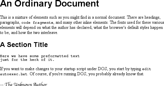
Figure 5-1. Various font families
Thus, most of the document will be in a serif font such as Times, including all
paragraphs except those that have aclassofsignature, which will instead be rendered in a
cursive font such as Author. Headings 1 through 4 will be in sans-serif font like
Helvetica, while the elementscode,pre,tt, andspan.inputwill be in a monospace font like
Courier—which, coincidentally, is how most of these elements are usually presented in
this book.
An author may, on the other hand, have more
specific preferences for which font to use in the display of a document or element.
In a similar vein, a user may want to create a user style sheet that defines the
exact fonts that are used in the display of all documents. In either case,font-familyis still the property to use.
Assume for the moment that allh1s should use
Georgia as their font. The simplest rule for this would be the following:
h1 {font-family: Georgia;}
This will cause the user agent displaying the document to use Georgia for allh1s, as shown in
Figure 5-2
.

Figure 5-2. An h1 element using Georgia
Of course, this rule assumes that the user agent has Georgia available for use. If
it doesn't, the user agent will be unable to use the rule at all. It won't ignore the
rule, but if it can't find a font called "Georgia," it can't do anything but displayh1elements using the user agent's default
font.
All is not lost, however. By combining specific font names with generic font
families,
you can create documents
that come out, if not exact, at least close to your intentions. To continue the
previous example, the following markup tells a user agent to use Georgia if it's
available, and to use another serif font if it's not.
h1 {font-family: Georgia, serif;}
If a reader doesn't have Georgia installed but does have Times, the user agent
might use Times forh1elements. Even though Times
isn't an exact match to Georgia, it's probably close enough.
For this reason, I strongly encourage you to always provide a generic family as
part of anyfont-familyrule. By doing so, you
provide a fallback mechanism that lets user agents pick an alternative when they
can't provide an exact font match. Such a backup measure is especially helpful since,
in a cross-platform environment, there is no way to know who has which fonts
installed. Sure, every Windows machine in the world may have Arial and Times New
Roman installed, but some Macintoshes (particularly older ones) don't, and the same
is probably true of Unix machines. Conversely, while MarkerFelt and Charcoal are
common to all recent Macintoshes, it's unlikely that Windows and Unix users will have
either font installed, and it is even less likely that they'll have both. Here are a
few more examples:
h1 {font-family: Arial, sans-serif;}
h2 {font-family: Charcoal, sans-serif;}
p {font-family: TimesNR, serif;}
address {font-family: Chicago, sans-serif;}
If you're familiar with fonts, you might have a number of similar fonts in mind
for displaying a given element. Let's say that you want all paragraphs in a document
to be displayed using Times, but you would also accept TimesNR, Georgia, New Century
Schoolbook, and New York (all of which are serif fonts). First, decide the order of
preference for these fonts, and then string them together with commas:
p {font-family: Times, TimesNR, 'New Century Schoolbook', Georgia,
'New York', serif;}
Based on this list, a user agent will look for the fonts in the order they're
listed. If none of the listed fonts are available, then it will simply pick a serif
font that is available.
marks
You may have noticed the presence of single
quotes in the previous example, which we haven't seen before. Quotation marks are
needed in afont-familydeclaration only if a
font name has one or more spaces in it, such as New York, or if the font name
includes symbols such as # or $. In both cases, the entire font name should be
enclosed in quotation marks to keep the user agent from getting confused about
what the name really is. (You might think the commas would suffice, but they
don't.) Thus, a font called Karrank% should probably be
quoted:
h2 {font-family: Wedgie, 'Karrank%', Klingon, fantasy;}
If
you leave off the quotation marks, there is a chance that user agents will ignore
that particular font name altogether, although they'll still process the rest of
the rule. Note that the quoting of a font name containing a symbol is not actually
required by the CSS2.1 specification. Instead, it's recommended, which is as close
to describing "best practices" as the CSS specification ever really gets.
Similarly, it is recommended that you quote a font name containing spaces. As it
turns out, the only required quotation is for font names that match accepted
keywords. Thus, if you call for a font whose actual name is "cursive," you'll need
to quote it.
Obviously, font names that use a single word—one that
doesn't conflict with any of the keywords forfont-family—need not be quoted, and generic family names (serif,monospace,
etc.) should never be quoted when they refer to the actual generic families. If
you quote a generic name, then the user agent will assume that you are asking for
a specific font with that name (for example, "serif"), not a generic
family.
As for which quotation marks to use, both single and double
quotes are acceptable. Remember that if you place afont-familyrule in astyleattribute, you'll need to use whichever quotes you didn't use for the attribute
itself. Therefore, if you use double quotes to enclose thefont-familyrule, then you'll have to use single
quotes within the rule, as in the following
markup:
p {font-family: sans-serif;}  /* sets paragraphs to sans-serif by default */

...

...
If
you use double quotes in such a circumstance, they interfere with the attribute
syntax, as you can see in
Figure
5-3
.
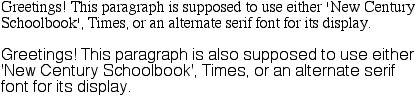
Figure 5-3. The perils of incorrect quotation marks