CSS: The Definitive Guide, 3rd Edition (17 page)
Read CSS: The Definitive Guide, 3rd Edition Online
Authors: Eric A. Meyer
Tags: #COMPUTERS / Web / Page Design

Figure 5-12
also demonstrates that,
althoughfont-sizeis inherited in CSS, it is the
computed values that are inherited, not percentages. Thus, the value inherited by thestrongelement is12px, and this value is modified by the declared value135%to arrive at16.2px(which will probably be rounded off to16px). For the "footnote" paragraph, the percentage is calculated in
relation to thefont-sizevalue that's inherited
from thebodyelement, which is15px. Multiplying that value by75%yields11.25px.
As with the relative-size keywords, percentages are effectively cumulative. Thus,
the following markup is displayed as shown in
Figure 5-13
:
p {font-size: 12px;}
em {font-size: 120%;}
strong {font-size: 135%;}
This paragraph contains bothemphasis and strong
emphasis, both of which are larger than the paragraph text.
 12px 14.4px  19.44px  12px

Figure 5-13. The issues of inheritance
The size value for thestrongelement shown in
Figure 5-13
is computed as follows:
| 12 px × 120% = 14.4px |
| 14.4px × 135% = 19.44px (possibly rounded to 19px) |
There is an alternative scenario, however, in which the final value is slightly
different. In this scenario, the user agent rounds off pixel size, and these rounded
values are then inherited normally by any child elements. Although this behavior
would be incorrect according to the specification, let's assume that the work agent
does it. Therefore, you would have:
| 12px × 120% = 14.4px [14.4px ≍ 14px] |
| 14px × 135% = 18.9px [18.9px ≍ 19px] |
If one assumes that the user agent is rounding off at each step, then the end
result of both this calculation and the previous one is the same: 19 pixels. However,
as more and more percentages are multiplied together, the rounding errors will begin
to accumulate.
The problem of runaway scaling can go the other direction, too. Consider for a
moment a document that is nothing but a series of unordered lists, many of them
nested inside other lists. Some of these lists are four nested levels deep. Imagine
the effect of the following rule on such a document:
ul {font-size: 80%;}
Assuming a four-level deep nesting, the most deeply nested unordered list would
have a computedfont-sizevalue 40.96 percent the
size of the parent of the top-level list. Every nested list would have a font size 80
percent as big as its parent list, causing each level to become harder and harder to
read. A similar problem can happen if you have a document that uses nested tables for
layout. You would then write a rule such as:
td {font-size: 0.8em;}
Either way, you're likely to end up with a page that's nearly impossible to
read.
Thefont-sizecan be
set using any of the length values discussed in detail in
Chapter 4
. All of the followingfont-sizedeclarations should be equivalent:
p.one {font-size: 36pt;}
p.two {font-size: 3pc;}
p.three {font-size: 0.5in;}
p.four {font-size: 1.27cm;}
p.five {font-size: 12.7mm;}
The display in
Figure 5-14
assumes
that the user agent knows how many dots per inch are used in the display medium.
Different user agents make different assumptions—some based on the operating system,
some based on preferences settings, and some based on the assumptions of the
programmer who wrote the user agent. However, the five lines should always be the
same size. So, while the result may not exactly match reality (for example, the
actual size ofp.threemay not be half an inch),
the measurements should all be consistent with one another.
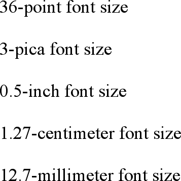
Figure 5-14. Various font sizes
There is one more value that is potentially the same as those shown in
Figure 5-14
, and that's36px, which would be the same physical distance if the
display medium is 72 pixels-per-inch (ppi). However, there are very few monitors with
that setting anymore. Most are much higher, in the range of 96ppi to 120ppi. Many
very old Macintosh web browsers treat points and pixels as though they are
equivalent, so the values14ptand14pxmay look the same on them. This is not, however,
the case for Windows and other platforms, including Mac OS X, which is one of the
primary reasons why points can be a very difficult measurement to use in document
design.
Because of these variations between operating systems, many authors choose to use
pixel values for font sizes. This approach is especially attractive when mixing text
and images on a web page, since text can (in theory) be set to the same height as
graphic elements on the page by declaringfont-size:11px;or something similar,
as illustrated by
Figure 5-15
.

Figure 5-15. Keeping text and graphics in scale with pixel sizes
Using pixel measurements forfont-sizeis
certainly one way to get "consistent" results withfont-size(and, indeed, with any length at all), but there is a major
drawback. Internet Explorer for Windows up through Version 6.0 does not allow users
to easily resize text that has been set with pixels. Other browsers, including
Mozilla, Netscape 6+, IE5+/Mac, Opera, and even IE7, allow the user to resize text no
matter how it's been set. Thus, using pixels to size text is no more of a guarantee
that it will stay the same size than is any other method. The other approaches
discussed in this chapter, such as keywords and percentages, are a much more robust
(and user-friendly) way to go, as they can be used to scale text from the user's
default font size.
[
*
]
Note that there are seven absolute-size keywords, just as there are seven
font sizes (e.g.,
Since the typical default font size
was historically 3, it makes sense that the third value on the CSS
absolute-size keyword list is used to indicate a default font size. Since the
third keyword turns out to besmall,
Explorer behaves accordingly.
Compared with everything we've covered so far, this section is
practically a no-brainer. The properties discussed herein are so straightforward, and
the complexities are so minimal, that this discussion will probably come as a great
relief. First, we'll talk aboutfont-style, and then
move on tofont-variantbefore wrapping up with the
font properties.
font-styleis very simple: it's used to select
betweennormaltext,italictext, andobliquetext.
That's it! The only complication is in recognizing the difference betweenitalicandobliquetext and in understanding why browsers don't always give you a choice.
font-style
- Values:
italic|oblique|normal|inherit- Initial value:
normal- Applies to:
All elements
- Inherited:
Yes
- Computed value:
As specified
The default value offont-styleis, as you can
see,normal. This refers to "upright" text, which
is probably best described as "text that is not italic or otherwise slanted." The
vast majority of text in this book is upright, for instance. That leaves only an
explanation of the difference betweenitalicandobliquetext. For that, it's easiest to refer
to
Figure 5-16
, which illustrates the
differences very clearly.

Figure 5-16. Italic and oblique text in detail
Basically, italic text is a separate font face, with small changes made to the
structure of each letter to account for the altered appearance. This is especially
true of serif fonts, where, in addition to the fact that the text characters "lean,"
the serifs may be altered in an italic face. Oblique text, on the other hand, is
simply a slanted version of the normal, upright text. Font faces with labels like
"Italic," "Cursive," and "Kursiv" are usually mapped to theitalickeyword, whileobliqueis
often assigned faces with labels such as "Oblique," "Slanted," and "Incline."
If you want to make sure that a document uses italic text in familiar ways, you
could write a style sheet like this:
p {font-style: normal;}
em, i {font-style: italic;}
These styles would make paragraphs use an upright font, as usual, and cause theemandielements to use an italic font—again, as usual. On the other hand, you might decide
that there should be a subtle difference betweenemandi:
p {font-style: normal;}
em {font-style: oblique;}
i {font-style: italic;}
If you look closely at
Figure 5-17
,
you'll see there is no apparent difference between theemandielements. In practice, not
every font is so sophisticated as to have both an italic face and an oblique face,
and even fewer web browsers are sophisticated enough to tell the difference when both
faces do exist.
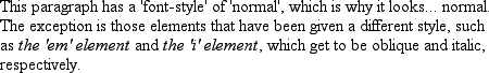
Figure 5-17. More font styles
If either of these is the case, then there are a few things that can happen. If
there is no "Italic" face, but there is an "Oblique" face, then the latter can be
used for the former. If the situation is reversed—an "Italic" face exists, but there
is no defined "Oblique" face—the user agent may
not
substitute
the former for the latter, according to the specification. Finally, the user agent
can simply generate the oblique face by computing a slanted version of the upright
font. In fact, this is what most often happens in a digital world, where it's fairly
simple to slant a font using a simple computation.
Furthermore, you may find that in some operating systems, a given font that has
been declared asitalicmay switch from being
italic to oblique depending on the actual size of the font. The display of Times on a
Macintosh running the Classic OS (Mac OS 9), for example, is shown in
Figure 5-18
, and the only difference is a
single pixel in size.

Figure 5-18. Same font, same style, different sizes
There isn't much that can be done about this, unfortunately, except better font
handling by operating systems, such as that found in Mac OS X and Windows XP.
Usually, the italic and oblique fonts look exactly the same in web browsers.
Still,font-stylecan be useful. For example,
it is a common typographic convention that a block quote should be italicized, but
that any specially emphasized text within the quote should be upright. To employ this
effect, which is illustrated in
Figure
5-19
, you would use these styles:
blockquote {font-style: italic;}
blockquote em, blockquote i {font-style: normal;}
Figure 5-19. Common typographical conventions through CSS
In addition to sizes and
styles, fonts can also have variants. CSS offers a way to address one very common
variant.
font-variant
- Values:
small-caps|normal|inherit- Initial value:
normal- Applies to:
All elements
- Inherited:
Yes
- Computed value:
As specified
As forfont-variant, it has only two
non-inheritvalues: the default ofnormal, which describes ordinary text, andsmall-caps, which calls for the use of small-caps text.
If you aren't familiar with such an effect, IT LOOKS SOMETHING LIKE THIS. Instead of
upper- and lowercase letters, a small-caps font employs uppercase letters of
different sizes. Thus, you might see something like that shown in
Figure 5-20
:
h1 {font-variant: small-caps;}
h1 code, p {font-variant: normal;}
The Uses of font-variant On the Web

The property font-variant is very interesting...

Figure 5-20. The small-caps value in use
As you may notice, in the display of theh1element, there is a larger uppercase letter wherever an uppercase letter appears in
the source and a small uppercase letter wherever there is a lowercase letter in the
source. This is very similar totext-transform:uppercase, with the only real difference being
that, here, the uppercase letters are of different sizes. However, the reason thatsmall-capsis declared using a font property is
that some fonts have a specific small-caps face, which a font property is used to
select.
What happens if no such face exists? There are two options provided in the
specification. The first is for the user agent to create a small-caps face by scaling
uppercase letters on its own. The second is simply to make all letters uppercase and
the same size, exactly as if the declarationtext-transform:uppercase;had been
used instead. This is obviously not an ideal solution, but it is permitted.
Internet Explorer for Windows took the all-caps route before IE6. Most other
browsers display small-caps text when asked to do so.