I Think You'll Find It's a Bit More Complicated Than That (13 page)
Read I Think You'll Find It's a Bit More Complicated Than That Online
Authors: Ben Goldacre

So. Last month energy company EDF conducted a poll on whether people near Hinkley Point nuclear power station would like it to be expanded. The
BBC dutifully reported
the results: ‘EDF Survey Shows Support for Hinkley Power Station’, said the headline. ‘Six in 10 people support a new power station at Hinkley’. Polls like this convince locals, and politicians.
But Leo Barasi at the blog ClimateSock has obtained
the original polling questions
from ICM, and found a masterclass in manipulation.
First, respondents are set into the frame with a simple starter: ‘How favourable or unfavourable is your opinion of the nuclear energy industry?’ Then things heat up. ‘To what extent do you agree or disagree with the following statement: Nuclear energy has disadvantages but the country needs nuclear power as part of the energy balance with coal, gas and wind power.’ As Leo says, this is structured in a way that makes it harder to disagree. ‘It appears reasoned: taking on board the downsides of nuclear before drawing a measured conclusion that it’s a necessary evil to produce a greater good.’ As a result, only 13 per cent disagree, but the whole audience is gently nudged.
Then locals are asked a whole series of branching questions, forcing them to weigh up the positive and negative impacts a new power station would have on the area. People who think it would be positive are asked to also weigh up the negative, and people who think it would be negative are asked to weigh up the positive factors, and everyone is asked to say why they think what they think.
Then, in a killer move, they’re asked: ‘How important, if at all, do you consider a new power station at Hinkley to each of the following? To the creation of local jobs? To the future of local businesses?’ And take a moment to reinforce those concerns: ‘Why do you say that?’
Finally, after being led on this thoughtful journey, and immediately after mulling over the beneficial economic impact it would have on their community, the locals are asked if they’re in favour of a new nuclear power station. It’s the results of this, the final question, that are reported in the press release and headlines.
To me it seems clear that this long series of preceding questions will guide people down a very specific path when thinking about a nuclear power station. It’s a guided narrative, and that might make sense if you were trying to advocate a kind of structured decision-making, but it’s very unlikely to produce results that reflect the true range of local views, partly because we’re all a bit thoughtless in the real world, and follow our guts in odd ways; but partly because the penultimate question is ‘Do you want your children to be unemployed?’ rather than ‘Are you secretly terrified we might cock up and give you cancer?’
So I still quite like nuclear power stations, but more than that, as ever, I salute the PR industry for finding new and elaborate ways to muddy the waters. And I salute the nerds who bust them for it.
Guardian
, 28 October 2011
The BBC has found a story
: ‘“Threefold
variation” in UK bowel cancer rates’
. The
average death rate
across the UK from bowel cancer is 17.9 per 100,000 people, but in some places it’s as low as nine, and in some places it’s as high as thirty. What can be causing this?
Journalists tend to find imaginary patterns in statistical noise, which we’ve covered many times before. But this case is particularly silly, as you will see, and it has a heartwarming, nerdy twist.
Paul Barden
is a quantitative analyst. He saw the story, and
decided to download the data
and analyse it himself. The claims
come from a press release
by the charity
Beating Bowel Cancer
: they’ve
built a map
where you can find your own local authority’s bowel cancer mortality rate and get worried, or reassured. Using a ‘scraping’ program, Barden brought up the page for each area in turn, and downloaded the figures. By doing this he could make a spreadsheet showing the death rate in each region, and its population. From here things get slightly complicated, but very rewarding.
We know that there will be random variation around the average mortality rate, and also that this will be different in different regions: local authorities with larger populations will have less random variation than areas with smaller populations, because the variation from chance events gets evened out more when there are more people.
You can show this formally. The random variation for this kind of mortality rate will follow
the Poisson distribution
(a bit like the
bell-shaped curve
you’ll be familiar with). This bell-shaped curve gets narrower – less random variation – for areas with a large population.
So, Barden ran a
series of simulations
in Excel, where he took the UK average bowel cancer mortality rate and a series of typical population sizes, and then used the Poisson distribution to generate figures for the bowel cancer death rate that varied with the randomness you would expect from chance.
This random variation predicted by the Poisson distribution – before you even look at the real variations between areas – shows that you would expect some areas to have a death rate of seven, and some areas to have a death rate of thirty-two. So it turns out that the real UK variation, from nine to thirty-one, may actually be
less
than you’d expect from chance.
Then Barden sent his blog to David Spiegelhalter, a Professor of Statistics at Cambridge, who runs the excellent website
Understanding Uncertainty
.
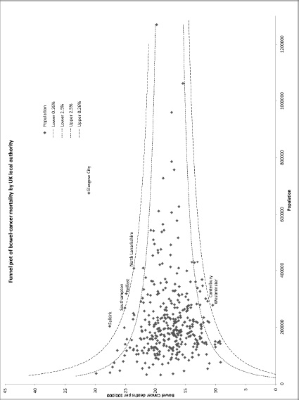
Spiegelhalter suggested that Barden
could present the real cancer figures as a funnel plot, and that’s what you see opposite.
I cannot begin to tell you how happy it makes me that Spiegelhalter, author of
Funnel Plots for
Comparing Institutional Performance
–
the citation classic
from 2005 – can be found by a random blogger online, and then collaborate to make an informative graph of some data that’s been over-interpreted by the BBC.
But back to the picture. Each dot is a local authority. The dots higher up show areas with more deaths. The dots further to the right show ones with larger populations. As you can see, areas with larger populations are more tightly clustered around the UK average death rate, because there’s less random variation in bigger populations. Lastly, the dotted lines show you the amount of random variation you would expect to see, from the Poisson distribution, and there are very few outliers (well, one main one, really).
Excitingly, you can also do this yourself online.
The Public Health Observatories
provide
several neat tools
for analysing data, and one will
draw a funnel plot
for you, from exactly this kind of mortality data. The bowel cancer numbers are in the table above. You can paste them into the Observatories’ tool, click ‘calculate’, and experience the thrill of touching real data.
In fact, if you’re a journalist, and you find yourself wanting to claim one region is worse than another, for any similar set of death rate figures, then do feel free to use this tool on those figures yourself. It might take five minutes.
The week after this column came out, a letter was published from Gary Smith, UK News Editor at the BBC. It said: ‘The BBC stands by this report as an accurate representation of the figures, which were provided by the reputable charity Beating Bowel Cancer. Dr Goldacre suggests the difference between the best- and worst-performing authorities falls within a range that could be expected through change [I don’t suggest this: I demonstrate it to be true]. But that does not change the fact that there is a threefold difference between the best and worst local authorities.’ This is a good example of the Kruger-Dunning effect: the phenomenon of being too stupid to know how stupid you’re being (discussed, if you’re keen to know more, in
Bad Science
,
here
).
When Journalists
Do Primary Research
Guardian
, 9 April 2011
This week some journalists found a pattern in some data, and ascribed a cause to it. ‘Recession linked to huge rise in antidepressants’
said the
Telegraph
. ‘Economic woes fuel dramatic rise in use of antidepressants’
said the
Daily Mail
. ‘Record numbers of people are
being handed antidepressants
’ said the
Express
. Even
the
Guardian
joined in
. It
seems to have come from a BBC
report.
The journalists are keen for you to know that these figures come from a Freedom of Information Act request, which surprised me, since each year – like you – I enjoy reading the Prescription Cost Analysis documents, which detail everything that has been prescribed over the previous year. The
2009 data
was published in April 2010, so I guess the 2010 data was
due about now
.
But are the numbers correct? Yes. From 2006 to 2010 there was a 43 per cent increase in the number of prescriptions for the SSRI class of antidepressants. Does that mean more people are depressed in the recession?
Firstly, this rise in scripts for antidepressants isn’t a new phenomenon. In 2009 the
BMJ
published a paper titled ‘Explaining the rise in
antidepressant prescribing
’, which looked at the period from 1993 to 2005. In the five years from 2000 to 2005 – the boom before the bust these journalists are writing about – antidepressant prescribing also increased, by 36 per cent. That isn’t very different from 43 per cent, so it feels unlikely that the present increase in prescriptions is due to the recession.
That’s not the only problem here. It turns out that the number of prescriptions for an SSRI drug is a pretty unhelpful way of measuring how many people are being treated for depression: not just because people get prescribed SSRIs for all kinds of other things, like anxiety, PTSD, hot flushes, and more; and not just because doctors have moved away from older types of antidepressants, so they would be prescribing more of the newer SSRI drugs even if the number of people with depression had stayed the same.
Excitingly, it’s a bit more complicated than that. A 2006 paper from the
British Journal of General Practice
looked at prescribing and diagnosis rates in Scotland. Overall, again, the number of prescriptions for antidepressants increased, from 1.5 million in 1996 to
2.8 million
in 2001 (that is, it almost doubled).
But the researchers of this paper also found a mystery: looking at the Scottish Health Survey, they found no increase in the prevalence of depression; and looking at the GP consultations dataset, they again found no evidence that people were presenting more frequently to their GP with depression, or that GPs were making more diagnoses of depression.
So why were antidepressant prescriptions going up? This puzzle received some kind of explanation in 2009.
The
BMJ
paper
above found the same increase in the number of prescriptions that the journalists reported this week, as I said. But they had access to more data: their analysis didn’t just look at the total number of prescriptions in the country, or even the total number of people diagnosed with depression: it also looked at the prescription records of individual patients, in a dataset of over three million patients’ electronic health records (with 200,000 people who experienced a first diagnosis of depression during this period).
They found that the rise in the overall number of antidepressant prescriptions was not due to increasing numbers of patients receiving antidepressants. It was almost entirely caused by one thing: a small increase in the small proportion of those patients who received treatment for longer periods of time. Numerically, people receiving treatment for long periods make up the biggest chunk of all the prescriptions written, so this small shift bumped up the overall numbers hugely.
I don’t know for certain if that phenomenon explains the increase in prescriptions from 2006 to 2010, as it does for the period 2000 to 2005 (although, in the absence of work examining that question, since the increase in scripts was so similar, it does seem fairly likely). And I’m not expecting journalists to go to academic research databases to conduct large, complex, descriptive studies.
But if they are going to engage in primary research, and make dramatic causal claims – as they have done in this story – to the nation, then they could also, usefully, read through the proper work that’s already been done, and consider alternative explanations for the numbers they’ve found.
Guardian
, 5 August 2011
Fox News was excited: ‘
Unplanned children develop more slowly
, study finds’. The
Telegraph
was equally shrill in its headline: ‘
IVF children have bigger vocabulary
than unplanned children’. And the
British Medical Journal
press release drove it all: ‘
Children born after an unwanted pregnancy
are slower to develop’.