CSS: The Definitive Guide, 3rd Edition (56 page)
Read CSS: The Definitive Guide, 3rd Edition Online
Authors: Eric A. Meyer
Tags: #COMPUTERS / Web / Page Design

After all of the effort expended in determining the width
of the table, you might well wonder how much more complicated height calculation will
be. Actually, in CSS terms, it's pretty simple, although browser developers probably
don't think so.
The easiest situation to describe is one in which the height is explicitly set via
theheightproperty. In such cases, the height
of
the
table is defined by the value ofheight. This
means that a table may be taller or shorter than the sum of its row heights, although
the 11 April 2006 draft of the CSS 2.1 specification states thatheightis treated as a minimum height for table boxes.
In such cases, the CSS2.1 specification explicitly refuses to define what should
happen, instead noting that the issue may be resolved in future versions of CSS. A
user agent could expand or shrink a table's rows to match its height, or leave blank
space inside the table's box, or something completely different. It's up to each user
agent to decide.
If the height of the table isauto, its height
is the sum of the heights of all the rows within the table, plus any borders and cell
spacing. To determine the height of each row, the user agent goes through a process
similar to that used to find the widths of columns. It calculates a minimum and
maximum height for the contents of each cell and then uses these to derive a minimum
and maximum height for the row. After doing this for all the rows, the user agent
figures out what each row's height should be, stacks them all, and uses that
calculation to determine the table's height. It's a lot like inline layout, only with
less certainty in how things should be done.
In addition to what to do about tables with explicit heights and how to treat row
heights within them, you can add the following to the list of things CSS2.1 does not
define:
The effect of a percentage height for table cells
The effect of a percentage height for table rows and row groups
How a row-spanning cell affects the heights of the rows that are spanned,
except that the rows must contain the spanning cell
As you can see, height calculations in tables are largely left to user agents to
determine. Historical evidence suggests that each user agent will likely do something
different, so you should probably avoid setting heights as much as possible.
In a rather interesting turn of events, alignment of
content within cells is much better defined than cell and row heights. This is true
even for vertical alignment, which could quite easily affect the height of a row.
Horizontal alignment is the simplest. To align content within a cell, you use thetext-alignproperty. In effect, the cell is
treated as a block-level box and all of the content within it is aligned as per thetext-alignvalue. (For details ontext-align, see
Chapter
6
.)
To vertically align content in a table cell,vertical-alignis the relevant property. It uses many of the same
values that are used for vertically aligning inline content, but the meanings of
those values change when applied to a table cell. To summarize the three simplest
cases:
topThe top of the cell's content is aligned with the top of its row; in the
case of row-spanning cells, the top of the cell's content is aligned with
the top of the first row it spans.bottomThe bottom of the cell's content is aligned with the bottom of its row;
in the case of row-spanning cells, the bottom of the cell's content is
aligned with the bottom of the last row it spans.middleThe middle of the cell's content is aligned with the middle of its row;
in the case of row-spanning cells, the middle of the cell's content is
aligned with the middle of all the rows it spans.
These are illustrated in
Figure
11-13
, which uses the following styles and markup:
table {table-layout: auto; width: 20em;
border-collapse: separate; border-spacing: 3px;}
td {border: 1px solid; background: silver;
padding: 0;}
div {border: 1px dashed gray; background: white;}
#r1c1 {vertical-align: top; height: 10em;}
#r1c2 {vertical-align: middle;}
#r1c3 {vertical-align: bottom;}
The contents of this cell are top-aligned. | The contents of this cell are middle-aligned. | The contents of this cell are bottom-aligned. |
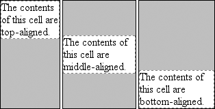
Figure 11-13. Vertical alignment of cell contents
In each case, the alignment is carried out by automatically increasing the padding
of the cell itself to achieve the desired effect. In the first cell in
Figure 11-13
, the bottom padding of the
cell has been changed to equal the difference between the height of the cell's box
and the height of the content within the cell. For the second cell, the top and
bottom padding of the cell have been reset to be equal, thus vertically centering the
content of the cell. In the last cell, the cell's top padding has been altered.
The fourth possible value alignment isbaseline, and it's a little more complicated than the first three:
baselineThe baseline of the cell is aligned with the baseline of its row; in the
case of row-spanning cells, the baseline of the cell is aligned with the
baseline of the first row it spans.
It's easiest to provide an illustration (see
Figure 11-14
) and then discuss what's happening.
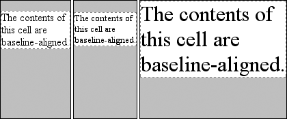
Figure 11-14. Baseline alignment of cell contents
A row's baseline is defined by the lowest initial cell baseline (that is, the
baseline of the first line of text) out of all of its cells. Thus, in
Figure 11-14
, the row's baseline was
defined by the third cell, which has the lowest initial baseline. The first two cells
then have a baseline of their first line of text aligned with the row's baseline.
As with top, middle, and bottom alignment, baseline-aligned cell content is placed
by altering the top and bottom padding of the cells. In cases where none of the cells
in a row are baseline-aligned, the row does not even have a baseline—it doesn't
really need one.
The detailed process for aligning cell contents within a row is as follows:
If any of the cells is baseline-aligned, the row's baseline is determined
and the content of the baseline-aligned cells is placed.Any top-aligned cell has its content placed. The row now has a provisional
height, which is defined by the lowest cell bottom of the cells that have
already had their content placed.If any remaining cells are middle- or bottom-aligned, and the content height
is taller than the provisional row height, the height of the row is increased
to enclose the tallest of those cells.All remaining cells have their content placed. In any cell whose contents
are shorter than the row height, the cell's padding is increased to match the
height of the row.
Thevertical-alignvaluessub,super,text-top, andtext-bottomare ignored when applied to table cells. Thus, the following
rule would have the same result as that shown in
Figure 11-14
:
th {vertical-align: text-top;}
Even if you're quite familiar with table layout from years of table-and-spacer
design, the mechanisms driving such layout are rather complicated and not at all
deterministic. Due to the legacy of HTML table construction, the CSS table model is
row-centric, but it does, thankfully, accommodate columns and limited column styling.
Thanks to new features that affect cell alignment and table width, you now have even
more tools for presenting tables in a pleasing way.
The ability to apply table-relateddisplayvalues
to arbitrary elements opens the door to creating table-like layouts using HTML elements
such asdiv, or in XML languages where any element
could be used to describe layout components. As of this writing, most browsers other
than Internet Explorer support the application of table-relateddisplayvalues to arbitrary elements. Even in its current form, CSS makes
presentation more sophisticated, as does the subject of the next chapter: generated
content.
In the realm of CSS layout, lists
are an interesting case. The
items in a list are simply block boxes, but with an extra bit that doesn't really
participate in the document layout hanging off to one side. With an ordered list, that
extra bit contains a series of increasing numbers (or letters) that are calculated and
mostly formatted by the user agent, not the author. Taking a cue from the document
structure, the user agent generates the numbers and their basic presentation.
None of this content generation could be described in CSS1 terms—and, therefore, it
couldn't be controlled—but CSS2 introduced features that allow list-item numbering to be
described. As a result, CSS now lets you, the author, define your own counting patterns and
formats, and associate those counters with
any
element, not just
ordered list items. Furthermore, this basic mechanism makes it possible to insert other
kinds of content, including text strings, attribute values, or even external resources into
a document. Thus, it becomes possible to use CSS to insert link icons, editorial symbols,
and more into a design without having to create extra markup.
To see how all these list options fit together, we'll explore basic list styling before
moving on to examine the generation of content and counters.
In a sense, almost
anything that isn't narrative text can be considered a list. The U.S. Census, the solar
system, my family tree, a restaurant menu, and even all of the friends you've ever had
can be represented as a list, or perhaps as a list of lists. These many variations make
lists fairly important, which is why it's a shame that list styling in CSS isn't more
sophisticated.
The simplest (and best-supported) way to affect a list's styles is to change its
marker type. The
marker
of a list item is, for example, the bullet
that appears next to each item in an unordered list. In an ordered list, the marker
could be a letter, number, or a symbol from some other counting system. You can even
replace the markers with images. All of these are accomplished using the different
list-style properties.
To change
the type of marker used for a list's items, use the propertylist-style-type.
list-style-type
- CSS2.1 values:
disc|circle|square|decimal|decimal-leading-zero|upper-alpha|lower-alpha|lower-roman|upper-roman|lower-greek|lower-latin|upper-latin|armenian|georgian|none|inherit- CSS2 values:
disc | circle | square|decimal | decimal-leading-zero | upper-alpha|
|lower-alpha | upper-roman | lower-roman | lower-greekhebrew|armenian|georgian|cjk-ideographic|hiragana|katakana|hiragana-iroha|katakana-iroha|none|inherit- Initial value:
disc- Applies to:
Elements whose
displayvalue islist-item- Inherited:
Yes
- Computed value:
As specified
That's quite a few keywords, I know; many of them were introduced in CSS2 but were
then dropped in CSS2.1.
Table 12-1
lists the keywords that exist in CSS2.1.
Table 12-1. Keywords of the list-style-type property in CSS2.1
Keyword | Effect |
|---|---|
| Uses a disc (usually a filled circle) for list-item markers |
| Uses a circle (usually open) for markers |
| Uses a square (filled or open) for markers |
| 1, 2, 3, 4, 5, . . . |
| 01, 02, 03, 04, 05, . . . |
| A, B, C, D, E, . . . |
| a, b, c, d, e, . . . |
| I, II, III, IV, V, . . . |
| i, ii, iii, iv, v, . . . |
| Lowercase classical Greek symbols |
| Traditional Armenian numbering |
| Traditional Georgian numbering |
| Uses no marker |
Table 12-2
lists those keywords that
were introduced in CSS2 but that do not appear in CSS2.1.
Table 12-2. Keywords of the list-style-type property in CSS2
Keyword | Effect |
|---|---|
| Traditional Hebrew numbering |
| Ideographic numbering |
| Japanese numbering (A, I, U, E, O...) |
| Japanese numbering (I, RO, HA, NI, HO...) |
| Japanese numbering (a, i, u, e, o...) |
| Japanese numbering (i, ro, ha, ni, ho...) |
A user agent should treat any value it does not recognize asdecimal.
Thelist-style-typeproperty, as well as all
other list-related properties, can be applied only to an element that has adisplayoflist-item,
but CSS doesn't distinguish between ordered and unordered list items. Thus, you might
be able to set an ordered list to use discs instead of numbers. In fact, the default
value oflist-style-typeisdisc, so you might theorize that without explicit
declarations to the contrary, all lists (ordered or unordered) will use discs as the
marker for each item. This would be logical, but, as it turns out, it's up to the
user agent to decide. Even if the user agent doesn't have a predefined rule such asol {list-style-type:decimal;}, it may prohibit ordered markers from being applied to
unordered lists, and vice versa. You can't count on this, so be careful.
For the CSS2 values such ashebrewandgeorgian, the CSS2 specification doesn't state exactly
how these counting systems work, nor how user agents should deal with them. This
uncertainty resulted in a lack of widespread implementation, which is why the values
in
Table 12-2
do not appear in CSS2.1.
If you want to suppress the display of markers altogether, thennoneis the value you should use.nonecauses the user agent to refrain from putting
anything where the marker would ordinarily be, although it does not interrupt the
counting in ordered lists. Thus, the following markup would have the result shown in
Figure 12-1
:
ol li {list-style-type: decimal;}
li.off {list-style-type: none;}
- Item the first
- Item the second
- Item the third
- Item the fourth
- Item the fifth
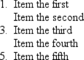
Figure 12-1. Switching off list-item markers
list-style-typeis inherited, so if you want to
have different styles of markers in nested lists, you'll likely need to define them
individually. You may also have to explicitly declare styles for nested lists because
the user agent's style sheet may have already defined them. For example, assume that
a user agent has the following styles defined:
ul {list-style-type: disc;}
ul ul {list-style-type: circle;}
ul ul ul {list-style-type: square;}
If this is the case (and it's likely that it will be), you will have to declare
your own styles to overcome the user agent's styles—inheritance won't be
enough.
Sometimes, a regular marker just won't do. You might
prefer to use an image for each marker, which is possible with the propertylist-style-image.
list-style-image
- Values:
| none|inherit- Initial value:
none- Applies to:
Elements whose
displayvalue islist-item- Inherited:
Yes
- Computed value:
For
values, the absolute URI; otherwise, none
Here's how it works:
ul li {list-style-image: url(ohio.gif);}
Yes, it's really that simple. One simpleurl( )value, and you're putting images in for markers, as you can see in
Figure 12-2
.
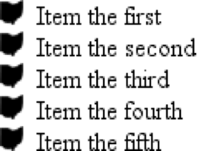
Figure 12-2. Using images as
markers
Of course, you should exercise care in the images you use, as the example shown in
Figure 12-3
makes painfully clear:
ul li {list-style-image: url(big-ohio.gif);}
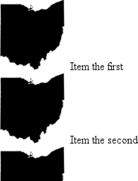
Figure 12-3. Using really big images as markers
It's generally a good idea to provide a fallback marker type in case your image
doesn't load, gets corrupted, or is in a format that some user agents can't display.
Do this by defining a backuplist-style-typefor
the list:
ul li {list-style-image: url(ohio.png); list-style-type: square;}
The other thing you can do withlist-style-imageis set it to the default value ofnone. This is good practice becauselist-style-imageis inherited, so any nested lists will
pick up the image as the marker, unless you prevent that from happening:
ul {list-style-image: url(ohio.gif); list-style-type: square;}
ul ul {list-style-image: none;}
Since the nested list inherits the item typesquarebut has been set to use no image for its markers, squares are used
for the markers in the nested list, as shown in
Figure 12-4
.
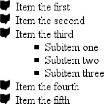
Figure 12-4. Switching off image markers in sublists
Remember that this scenario might not occur in the real world: a user agent may
have already defined alist-style-typeforul ul, so the value ofsquarewon't be inherited after all. Your browser may
vary.