Presentation Zen: Simple Ideas on Presentation Design and Delivery, 2nd Edition (Ira Katz's Library) (24 page)
Authors: Garr Reynolds

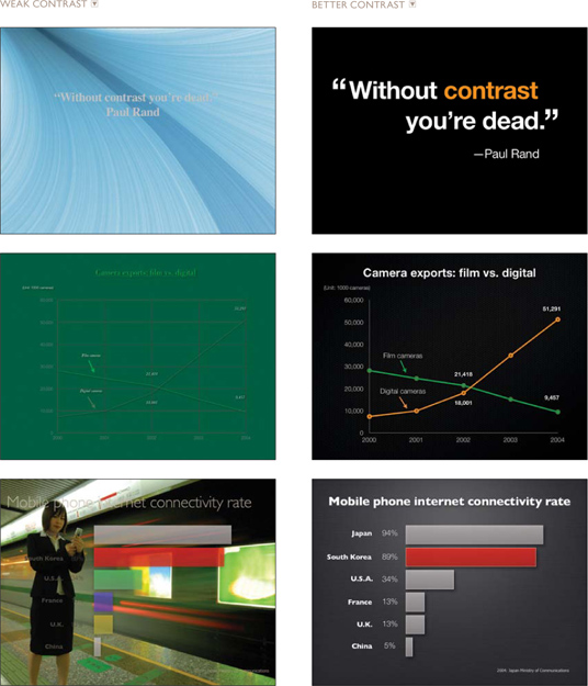
Every single element of a design—such as line, shape, color, texture, size, space, and type—can be manipulated to create contrast. The next page compares slides that make good use of contrast to slides with weaker contrast.
The principle of repetition simply means the reuse of the same or similar elements throughout a design. Repetition of certain design elements in a slide or among a deck of slides will bring a clear sense of unity, consistency, and cohesiveness. Where contrast is about showing differences, repetition is about subtly using elements to make sure a design is viewed as part of a larger whole. If you use a stock template from your software application, then repetition is already built into your slides. For example, a consistent background and consistent use of type adds unity across a deck of slides.
However, you must be careful not to have too much repetition among slides. Most of the built-in templates have been seen many times before and may not suit your unique situation. Many of the standard templates also have background elements that soon become tiring and make it difficult to distinguish between slides. For example, let’s say you use a starfish image in the lower right corner of slides for a presentation on marine biology. To make the starfish a stronger repetitive element, vary its size and location occasionally and in harmony with the content of the different slides (but in a subtle way that does not interfere with the primary message).
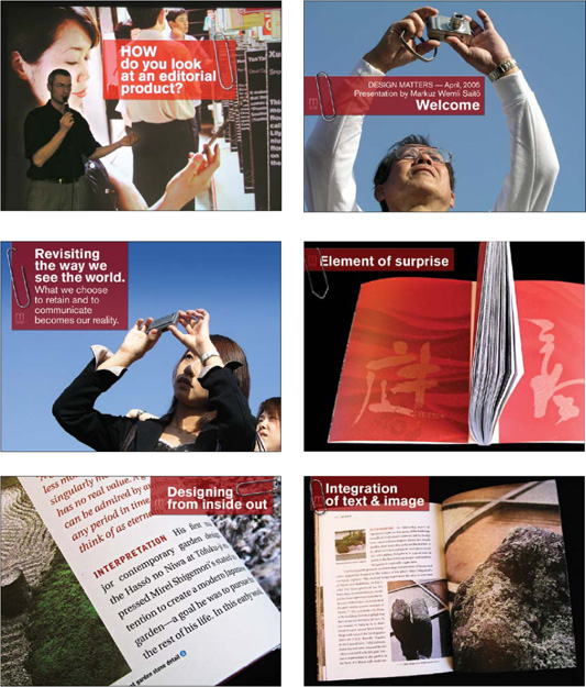
The slides on the next page show good examples of repetition. For his presentation on the process of designing a book, Swiss designer and photographer Markuz Wernli Saito used his own full bleed photos for all his slides. To help give the entire presentation a unified look, he used a similar red note and paperclip to “hold” the text in each slide. While he varied the placement and size of the note and paperclip image, the consistent use of the element and the red color gave his visuals a professional and unified look.
The whole point of the alignment principle is that nothing in your slide design should look like random placement. Every element is connected visually via an invisible line. Where repetition is more concerned with elements across a deck of slides, alignment is about obtaining unity among elements of a single slide. Even elements that are quite far apart on a slide should have a visual connection, something that is easier to achieve with the use of grids. When you place elements on a slide, try to align them with an existing element.
Many people fail to apply the alignment principle, which often results in elements being almost—but not quite—aligned. This may not seem like a big deal, but these kinds of slides look less sophisticated and less professional overall. The audience may not be conscious of it, but slides that contain elements in alignment look cleaner. And, assuming other principles are applied harmoniously as well, slides with aligned elements should be easier to understand quickly.
The principle of proximity is about moving things closer or farther apart to achieve a more organized look. The principle says that related items should be grouped together so they will be viewed as a group, rather than as several unrelated elements. Viewers will assume that items that are not near each other are not closely related. They will naturally tend to group similar items that are close to each other into a single unit.
Audience members should never have to “work” at trying to figure out which caption goes with which graphic or whether a line of text is a subtitle or a line of unrelated text. Do not make audiences think. That is, do not make them “think” about the wrong stuff, like trying to decipher your slide’s organization and design priority. A slide is not a page in a book or magazine, so you are not going to have more than a few elements or groups of elements. In her bestselling book
The Non-Designer’s Design Book
(Peachpit Press), Robin Williams says that we must be conscious of where our eye goes first when we step back and look at our design. When you look at your slide, notice where your eye is drawn first, second, and so on. What path does your eye take?
This title slide lacks a design priority. Due to the poor use of alignment and proximity, the slide seems to contain five different elements.
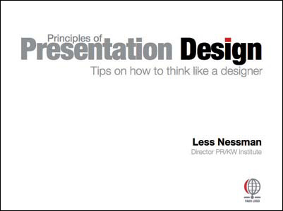
This slide uses symmetrical balance and better proximity, with related items now clearly together. Greater contrast is achieved by adjusting the type size and color to give the design a clear priority.
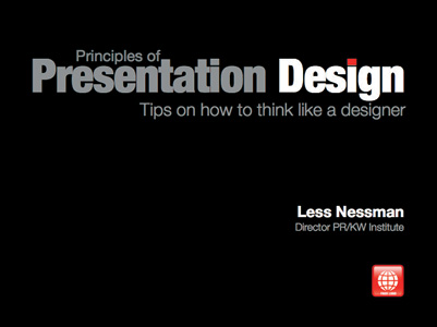
These two slides show how aligning all elements flush right creates a strong invisible line that ties all the elements together in a way that is more interesting than the more common symmetrical title. The type and color are also adjusted to create greater contrast and interest. The red dot in the title ties in with the red logo at the bottom.
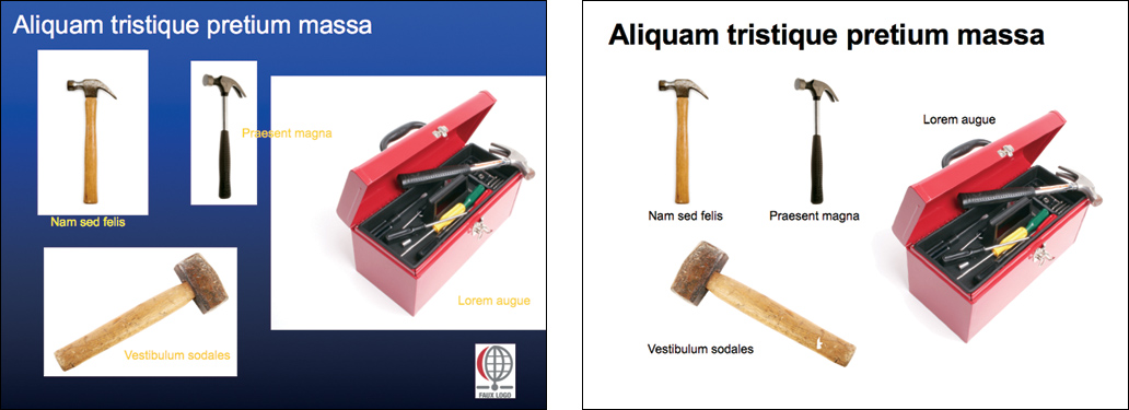
The slide on the left looks busier due to the abrupt contrast between the background color of the images. By aligning the text and photos and making the image backgrounds transparent (in this case, by simply changing the slide background to white) the slide is much cleaner and noise is reduced.
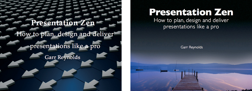
In the slide on the left, the background image has too much salience, making the title hard to see. Choosing a more appropriate background image that allows the text to remain clearly in the foreground and grouping the text lines makes for a stronger title slide.