Read Happy City: Transforming Our Lives Through Urban Design Online
Authors: Charles Montgomery
Happy City: Transforming Our Lives Through Urban Design (24 page)

The scene enthralled the pioneering neuroimmunologist Esther Sternberg on her first visit. Sternberg, who examines the connection between environment, health, and the human brain, concluded that Main Street U.S.A.’s designers had an uncanny understanding of the neuroscience of place. “They did it brilliantly. They figured out in the 1950s and ’60s, long before we understood neuroscience, exactly how to use design to get people from a place of anxiety and fear to a place of hope and happiness,” she told me.
The key to the place effect lies in the way that the brain links memory and emotion. On the one hand, Main Street U.S.A.’s evocative landmarks—quaint train station, city hall, distant Sleeping Beauty castle—instantly orient you to the landscape, reducing the anxiety you are hardwired to feel when you are unsure of your location in a complex environment. At the same time, those elements serve as emotional triggers. The hippocampus responds not just to visual signals, but to all our senses, including smell. So whether it is a candy-striped awning or the scent of cooking fudge wafting out over the sidewalk, Disney’s references trigger memories that produce feelings of safety and calm—though these memories are just as likely to have been drawn from an invented past as from our own experiences. (The effect is so powerful that developers of care facilities for dementia patients have replicated Main Street U.S.A. in common spaces whose landmarks and street activity are intended to comfort residents with reminders of a small-town past.)
Designing Antisociality
Disney’s street may be a simulacrum, an imitation of someone’s idea of a real place, but the calming and pro-social effect it has on people is undeniable. This is not to suggest that every public space should attempt Disney’s historical trickery, but we should acknowledge that every urban landscape is a collection of memory- and emotion-activating symbols. Every plaza, park, or architectural facade sends messages about who we are and what the street is for.
The effect of aesthetics on emotions has been documented extensively. We know, for example, that the frequent sight of garbage, graffiti, and disrepair produces alienation and depression, especially among the elderly. We know from research on biophilia that infusions of nature don’t merely calm the mind, they alter our attitudes, making us more trusting and generous toward other people.
We also know that sharp architectural angles light up the brain’s fear centers much like the sight of a knife or a thorn, releasing stress hormones that make us less likely to pause and engage with places and people. (This effect can be witnessed on the street outside Daniel Libeskind’s Crystal, an addition to the Royal Ontario Museum in Toronto, where giant prisms of steel, aluminum, and glass slice threateningly toward the sidewalk, managing the amazing feat of emptying people from a once-busy stretch of Bloor Street.)
But the urban landscape does not need to adopt a spectacularly threatening stance to drive people away. Antisocial spaces are as common in the city as blank walls. In fact, blank walls are part of the problem.
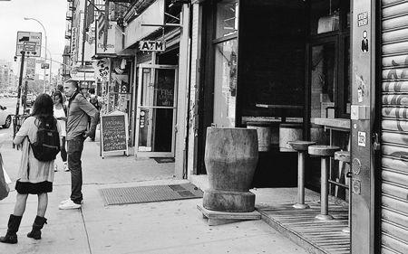
Jan Gehl’s studies of street edges provide evidence. Gehl and others have found that if a street features uniform facades with hardly any doors, variety, or functions, people move past as quickly as possible. But if a street features varied facades, lots of openings, and a high density of functions per block, people walk more slowly. They pause more often. People are actually more likely to stop and make cell phone calls in front of lively facades than in front of dead ones.
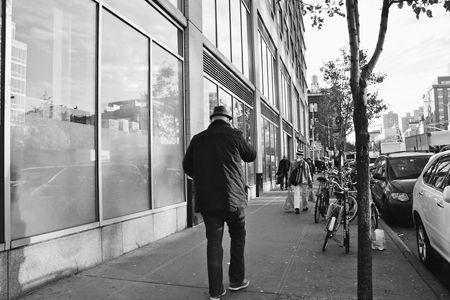
During our experiments at the BMW Guggenheim Lab in New York City, we found that such long, dead facades do not just speed people up physically; they bring them down emotionally. On East Houston Street in Lower Manhattan, the small-lot urban fabric between Orchard and Ludlow was replaced in 2006 by a Whole Foods grocery store that presents a nearly unbroken swath of smoked glass for much of an entire city block. Volunteers who joined our psychological tours of the neighborhood reported feeling markedly less happy on the sidewalk outside this facade than almost anywhere else on their tour. They felt much better once they got to a grittier but lively stretch of shops and restaurants just a block east on Houston.
This points to an emerging disaster in street psychology. As suburban retailers begin to colonize central cities, block after block of bric-a-brac and mom-and-pop-scale buildings and shops are being replaced by blank, cold spaces that effectively bleach street edges of conviviality. It is an unneccessary act of theft, and its consequences go beyond aesthetics, or even the massive reduction in the variety of goods and services that results when one giant retailer takes over a block. The big-boxing of a city block harms the physical health of people living nearby, especially the elderly. Seniors who live among long stretches of dead frontage have actually been found to age more quickly than those who live on blocks with plenty of doors, windows, porch stoops, and destinations. Because supersize architecture and blank stretches of sidewalk push their daily destinations beyond walking distance, they get weaker and slower, they socialize less outside the home, and they volunteer less.
*
Emotional Landscapes
East Houston Street, New York City: People reported feeling significantly happier along the messy but active street front at top than they did along the blank but tidy facade at bottom.
(
Top
: Charles Montgomery;
above
: Alexandra Bolinder-Gibsand)
Fortunately, some cities have begun to enact laws to stop developers from killing the sociability of their streets. The Australian city of Melbourne adopted rules banning long, blank facades and forcing new shops and restaurants to have doors or display windows covering at least 80 percent of their frontage. Danish cities have gone further. In the 1980s most large cities in the country actually restricted banks from opening new branches on their main shopping streets. It is not that Danes hate banks; it is that passive bank facades bleed life from the sidewalk, and too many of them can kill a street. It is that the citizenry’s right to a healthy, life-giving public realm has trumped anyone’s right to kill it—a notion presumably ignored on those Manhattan blocks where four banks compete across corners.
New York City began playing catch-up in 2012, adopting new zoning that limited the ground-floor width of new stores on major avenues on the Upper West Side. On busy Amsterdam and Columbus avenues, buildings on lots wider than fifty feet will have to feature at least two nonresidential businesses, and transparent facades. Banks on Broadway will be restricted to just twenty-five feet of frontage. The move was partly an attempt to stop big national retailers and banks from gobbling up the mom-and-pop stores that give the neighborhood its character. “Stores are the soul of the neighborhood,” Gale Brewer, a neighborhood councilwoman, told
The New York Times
. “Small pharmacies, shoe stores, they mean everything to us.” By saving small business, the measure would also save human-scale blocks.
Vancouver has proved that dense cities can meet commercial real estate needs while keeping their architecture friendly. Even big-box retailers have had to change up their morphology to get a toehold in the city. Thus, a Costco and its parking lot were buried beneath slim condo towers and rows of street-level town houses on one end of Vancouver’s downtown peninsula. And near City Hall, a Home Depot and a Winners have been stacked like a hamburger patty
on top
of a row of street-front businesses and
beneath
a leafy garnish of garden apartments. The big boxes get their own entrances on the corner, while the rest of the block facade is shared by a Starbucks, a grocer, and several other shops. The result: the urge for low prices does not kill the street. People actually walk, bike, or take the subway to the big box and sit out front at the Starbucks, sipping their lattes in the rain.
Reoccupation
Some designers work specifically to drive people away. For a time, there was perhaps no greater density of antisocial public spaces on earth than Midtown Manhattan. In 1961 the city enacted a well-meaning ordinance granting developers the right to build higher towers in exchange for building public plazas on their property. What happened in the following decades showed just how dangerous it can be to leave the design of public life to private hands.
Most of these private-public spaces—commonly known as bonus plazas—were deeply misanthropic. General Motors got seven extra stories for building a plaza in front of its monolithic tower on Fifth Avenue in 1968, but the architect sank the plaza deep below the street and capped its ledges with railings that, as William Whyte noted, were perfect for catching you right in the small of the back should you try to sit. This was no anomaly. By 2000, more than half of the bonus plazas in Midtown and the Financial District either did not attract people or actively repelled them. This was exactly their intent. Richard Roth, whose firm, Emery Roth and Sons, designed a quarter of the bonus plaza buildings in midtown and downtown, told sociologist Gregory Smithsimon that his clients explicitly instructed him to build plazas that encouraged people to move through them quickly and not stop. “They kept putting less and less in. The client kept saying, ‘No, I want it as minimal as possible,’” Roth recalled. It was acceptable to have people pause and gape at the architecture. It was not acceptable for them to get too comfortable.
Sometimes the designers used gates and fences to achieve the desired antisocial effect, but painful seating, odd edges, and sunken areas that were dark, cold, hard to reach, and scary were just as effective. Sometimes they left the plaza space entirely blank, creating empty deserts in what were otherwise crowded, space-starved districts. Citizens had traded the air above their cities to property developers for much-needed public space on the ground, only to see developers use design to steal it back.
But the movement to invite people back to city spaces that began in Copenhagen has spread to cities around the world. In New York City, William Whyte’s followers have used his theories on sociability to repair the sickliest of places. Whyte’s onetime research assistant Fred Kent founded the nonprofit Project for Public Spaces to carry out the social observer’s vision. Early on, Project for Public Spaces was asked by the owners of Rockefeller Center to suggest how spikes might be configured to keep people from sitting under or touching the yew trees on their plaza. The plaza management had always seen people as a problem. They did not want the hassle of dealing with vagrants or litterbugs. Kent politely suggested that rather than fortifying their trees, they add benches for people to sit on. The owners took a chance and retrofitted the plazas to accommodate, rather than repel, people. It was the beginning of a gradual transformation that has seen Rockefeller Center become one of the most visited sites in the entire city. Here, and everywhere they intervene, Whyte’s disciples employ a method he called triangulation, in which external stimuli are arranged in ways that nudge people close enough together to begin talking. In its simplest form, triangulation might mean positioning a public telephone booth, a garbage can, and a bench beside one another, or simply giving a busker permission to perform near a set of stairs—anything to slow people down in proximity.
Once you become aware of the method, it’s possible to see triangulation at work in most of the world’s best-loved public places. It works in the Piazza del Campo, where cafés, museums, bollards, and that sloping brick amphitheater create multiple reasons for arrival. The Place des Vosges, the oldest planned square in Paris, was itself conceived as a living room for the city when it was laid out more than four hundred years ago. Today, lawns, sandboxes, and fountains compete for attention with the lure of the shops and cafés that line the arcades at the square’s edge.
Triangulation found new life in higher-stakes design when another of Whyte’s disciples, Amanda Burden, was hired as New York City’s director of planning. Under Burden’s tenure, the repopulation of the city’s bonus plazas began in earnest. The once-desolate General Motors Building plaza, for example, has been reinvigorated with a blend of public comforts and commercial panache. Movable chairs and tables sit beneath half a dozen honey locust trees overlooking a shallow pool, creating an inviting lunchtime destination. But the plaza’s most memorable feature is the house-size glass cube that sits at its heart. Reminiscent of I. M. Pei’s Pyramid in the courtyard of the Louvre, the cube is actually an entrance to a subterranean Apple Store. The space vibrates with life at various speeds and intimacies. On a late September afternoon I observed a young girl poking at her reflection in the pool, a suited businessman crumpled in a power snooze, a dozen couples lunching together, and dozens more simply eyeing the rest of us. It was people that made the space most interesting and worthwhile, but it took design to draw us together and slow us down just enough to transform that landscape of marble, concrete, water, and glass into a social environment.